geru-sale.xyz
Landing Page Analysis
Summary:
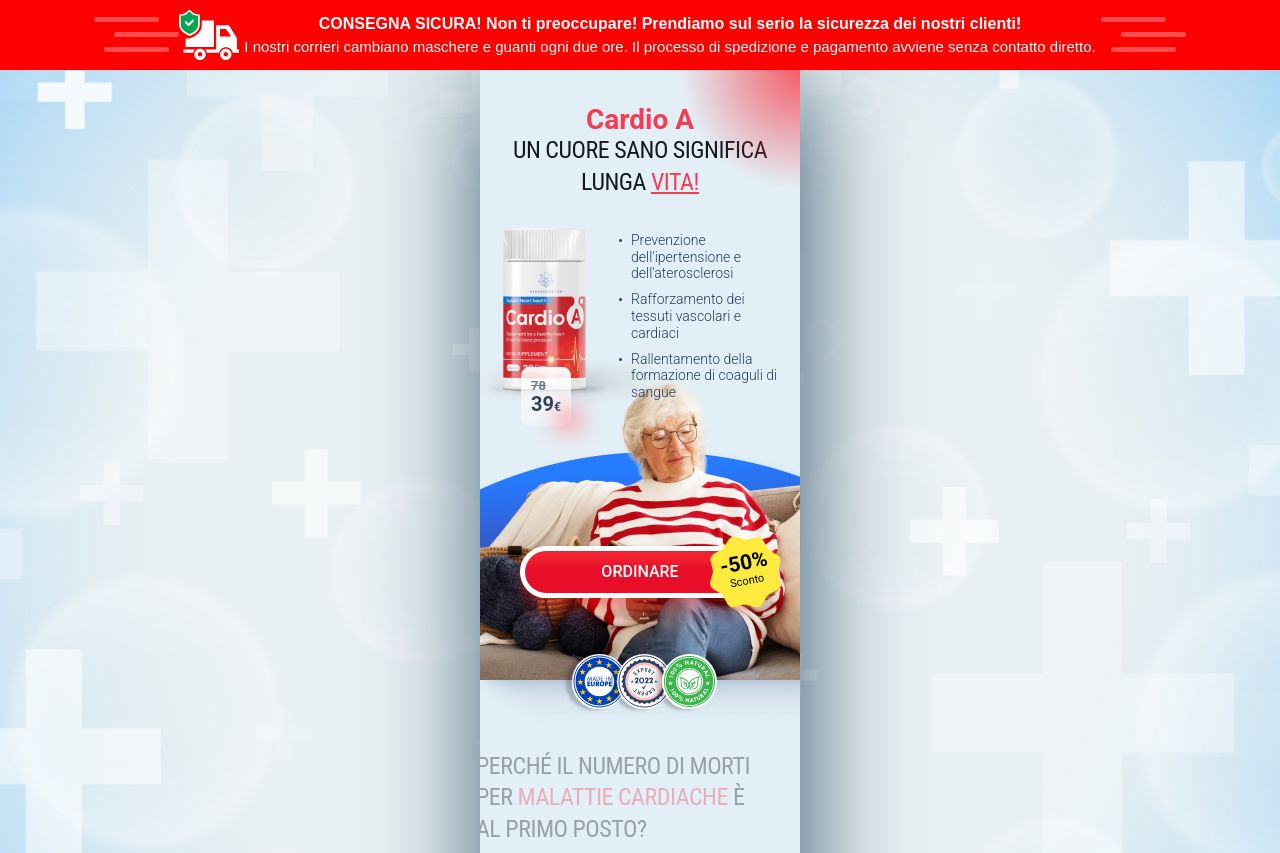
The landing page is cluttered and chaotic, with a glaring lack of focus. The overuse of urgent red colors and the repetitive, excessive use of discounts everywhere make the whole presentation feel untrustworthy. It screams desperation rather than fostering trust. The CTA ("Ordinare")s are overpopulated and don't stand out due to the repetitive design; they blend into the visual noise of the page. Imagery of the heart feels clichéd and lacks innovation, underwhelming potential customers. The message lacks sophistication; the content is overly simplistic, communicating to an audience that needs clear, authoritative guidance. The trust elements are fine, but there's nothing distinctive or credible enough to make the page stand out. Overall, the page relies too heavily on negative emotions, rather than building positive associations with the product.
- Simplify layout to focus on one or two primary messages.
- Use less aggressive colors to avoid overwhelming visitors.
- Improve CTA focus by reducing their frequency and enhancing visual contrast.