netlify.app
Landing Page Analysis
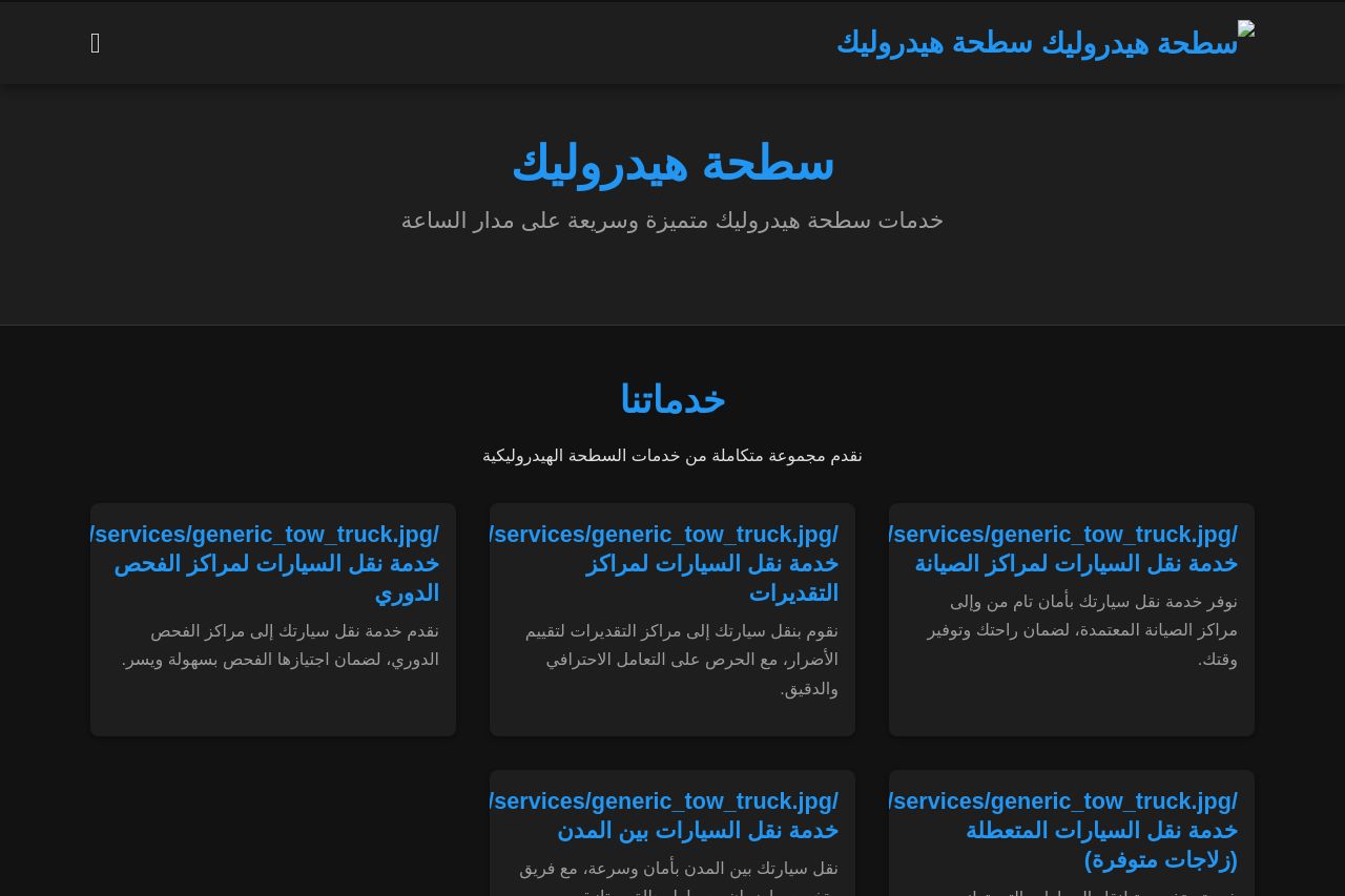
خدمات سطحة هيدروليك متميزة وسريعة لسحب ونقل السيارات على مدار الساعة في جميع المناطق

Summary:
The landing page is a messy concoction of familiar design flaws, utterly failing many of the cold hard criteria for effective landing pages. The hero section fails to immediately communicate what the product or service is, doing nothing to help the user understand its main value. Its design is as uninspired as it gets, showing little evidence of thoughtful application of contrast, hierarchy, or emphasis. The page is tragically lacking in visual appeal, with a drab color scheme reminiscent of office supply stock photos from the early 2000s. The page is plagued with lazily written copy that fails to resonate or connect with any identifiable audience. Overall, the site reeks of a templated approach with little original thought or expertise behind it.
On top of that, social proof seems like an afterthought, nearly nonexistent, therefore failing to build any form of trust. Without an ounce of creativity or professionalism present, there's little wonder as to why a user would stick around or perceive any credibility. The call-to-action is weak, unimaginatively blending into the rest of the uninspiring background. In terms of transparency, well, the user can enjoy guessing which corner of the web bit this one off. This landing page could do with a major redesign if it aims to convert a soul.
- Redefine value proposition by clearly stating what the service does right on the hero section.
- Simplify and clarify the call-to-action to make it pop, and place it strategically for higher visibility.
- Integrate genuine testimonials or client logos to add trustworthiness and credibility.
- Work on the color scheme to create a less chaotic and juvenile visual language to match the target audience.
- Correct the chaotic visuals, employ contrast and white space for a clean, professional look.