lux-transfer.com
Landing Page Analysis
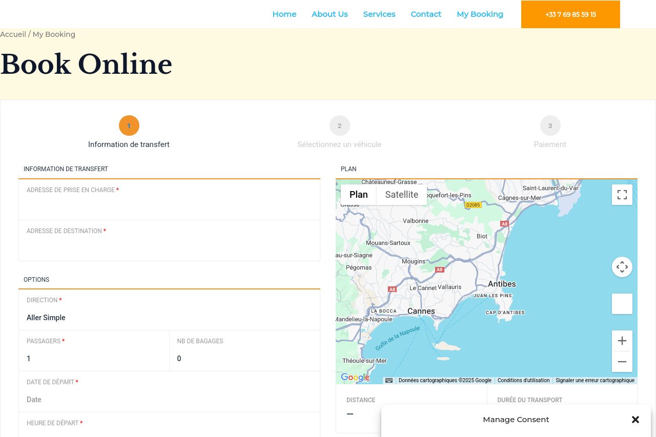
Book Online
Summary:
The landing page for booking online at "Luxury Transfer" tries to create a seamless experience but falters in several areas. The section where users are supposed to book is cluttered and gives a feeling of being thrown together without much thought. There's a massive issue with clarity—what exactly is "My Booking" referring to? No clear features or benefits are listed, leaving potential customers wondering why they should choose this service.
The readability is hit or miss. While some basic layout choices like font size help, the huge cookie consent pop-up is a distracting eyesore, especially if it's covering vital information.
Design-wise, the page doesn’t give off a professional or trustworthy vibe. The colors are plain and devoid of life, doing nothing to draw attention or guide the eyes efficiently. Consistency is another problem, with too many different elements cluttering the layout.
In terms of actionability, CTAs are present but feel like more of an afterthought. There's no urgency or compelling reason given to press those buttons, making them rather impotent.
- Improve the clarity of the booking form and highlight its benefits.
- Revamp the color scheme to produce a more engaging and professional look.
- Make call-to-action buttons more compelling and visible.