dotts.se
Landing Page Analysis
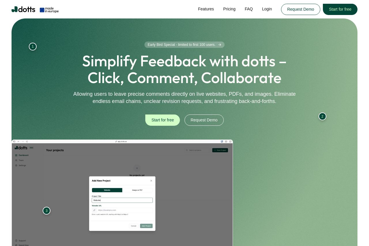
Simplify feedback with dotts! Click on live websites, PDFs, or images to leave precise comments. No signups required for clients. Start for free today!
Summary:
Overall, the dotts landing page does a solid job of communicating its core features and benefits. The value proposition is clear, with a strong emphasis on simplifying feedback, which is well-relevant to design freelancers and agencies. Visuals are cohesively integrated, enhancing user engagement without causing distraction. However, the CTAs could be more diverse and strategically positioned for maximum impact and sometimes blend too seamlessly with their surroundings, reducing focus on conversion. The design maintains a clean and consistent style, using a cohesive green palette, but it might benefit from more differentiation in sections to guide the user more effectively. Several elements, including testimonials or recognizations, could be elevated to boost credibility further. Page flow is logical, ensuring easy navigation, though some sections could better highlight unique selling points or show specific user scenarios. Overall, the landing page is well-crafted but could benefit from minor tweaks to optimize conversion potential.
- Enhance CTA visibility and actionability by using more contrasting colors or unique button designs.
- Incorporate more social proof elements, such as testimonials or well-known client logos, to increase credibility.
- Refine the organization of information in some sections to better highlight unique features or benefits.