rakhisawant.in
Landing Page Analysis
Sunday, June 22
Summary:
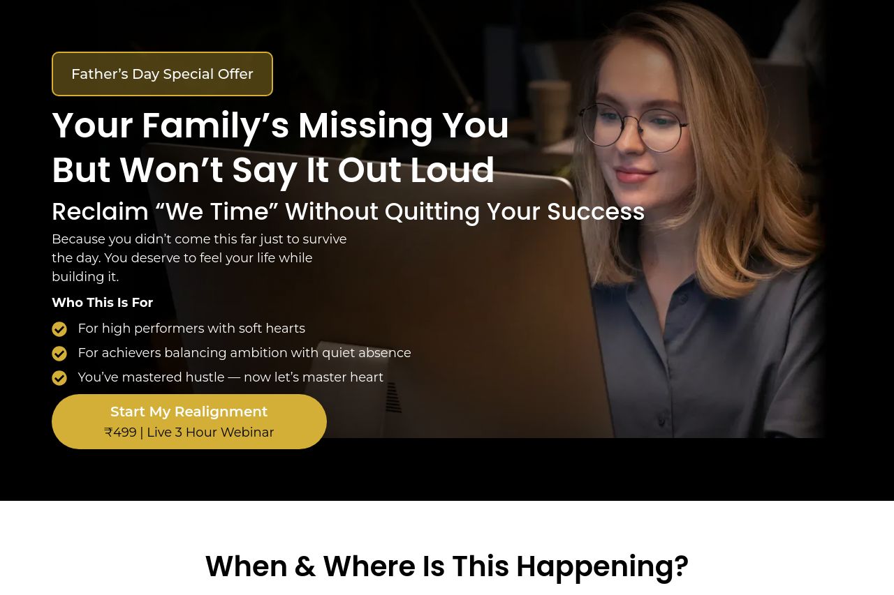
The landing page heavily focuses on emotional appeal, targeting high achievers who may struggle with work-life balance. The use of relatable family-focused messaging effectively tugs at emotional strings but can come across as a bit manipulative. Imagery is appropriate but lacks diversity, both in context and representation. The repeated emphasis on reclaiming "we time" is good but gets a bit repetitive, losing impact as a result.
Visually, the design is clean and the use of black and yellow consistently draws attention without becoming overbearing. Typography and layout are generally effective, aiding in readability but could use more differentiation in heading sizes or styles. The CTA buttons are numerous yet somewhat vague; they stand out visually but lack compelling action-oriented text.
The overall tone and language resonate with the intended audience but risk becoming monotonous, more variety could enhance interest and retention. Testimonial sections add credibility but lack detailed context about how others have benefited. There's a noticeable absence of urgency and a strong emphasis on generic, abstract benefits which might not be convincing enough.
- Clarify and specify the benefits offered to reinforce the value proposition.
- Enhance the differentiation of headings and CTAs to create stronger visual hierarchy.
- Add more context to testimonials to increase credibility and relatability.