telollevamos.com
Landing Page Analysis
Telollevamos.com - Compra en USA y recibe en Ecuador en tiempo récord. Nosotros nos encargamos de todo.
Summary:
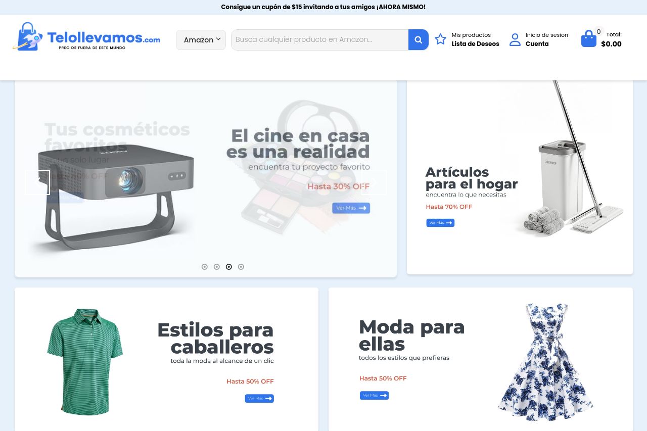
The overall layout of the page is clean and fairly organized, with sections neatly divided and an easy-to-read font. However, it all feels too generic and lackluster. While the product images are clear, they do nothing to make the listing stand out, and without creative or enticing descriptions, the page falls flat. There's a heavy reliance on discounts and percentages to capture interest, which might work but lacks imagination. The color scheme is pleasant but mundane, not encouraging the excitement you'd expect from a shopping site. Some consistency in design elements saves it from being completely uninspired, but the execution lacks innovation.
- Make the value proposition clearer with stronger messaging and unique selling points.
- Enhance the visual hierarchy to make important elements pop and capture the user's attention.
- Improve CTA visibility and actionability to guide users through the purchasing process more effectively.