com.hk
Landing Page Analysis
Professional accounting services to help your business thrive
Summary:
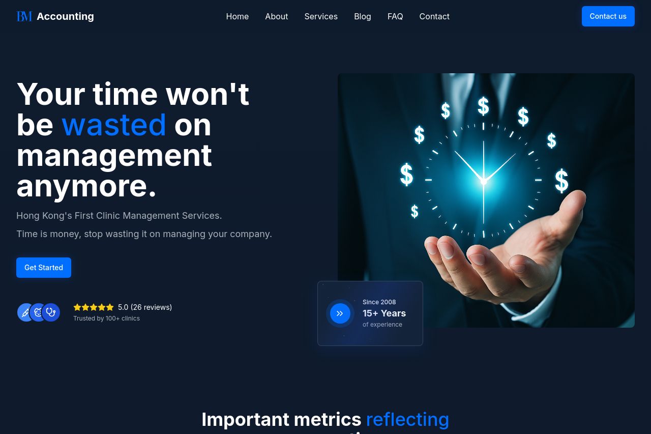
The landing page for BM Accounting is quite polished, visually cohesive, with a strong emphasis on the services it offers. The design uses a clear color scheme of blue and white, providing good readability and professional appeal. The headers are catchy with clear, large, and bold fonts, emphasizing key points like "wasted time" and "clinic management services." Social proof is effectively used with client logos, testimonials, and statistics that highlight their expertise and reliability. However, the pitch feels overly generic in some places, lacking in emotional appeal or unique value. The calls to action (CTAs) are placed adequately, but some sections feel underwhelming without strong visual or message-driven impact. While the structure follows a logical path, aligning services next to testimonials might help in following the customer journey more seamlessly. Overall, it’s a fairly standard landing page that could stand to be more distinctive in persuasion tactics.
- Enhance the unique value proposition by emphasizing what differentiates your services.
- Include more dynamic CTAs that invoke urgency or curiosity to increase engagement.
- Improve messaging clarity by tightening descriptions to be more punchy and compelling.