resmic.com
Landing Page Analysis
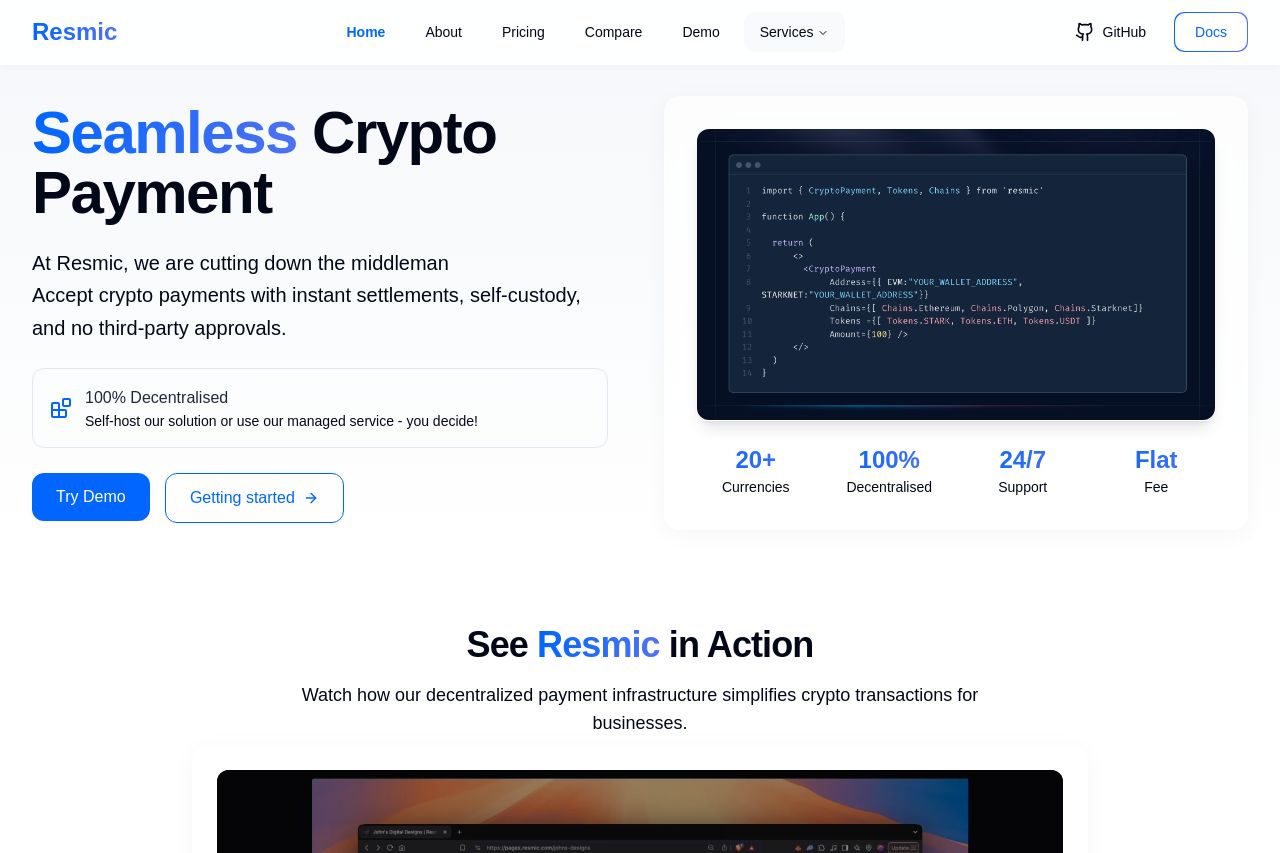
Fast, secure, open source, fully decentralised crypto payment infrastructure. Accept payments with instant settlements, self-custody, and no third-party approvals.

Summary:
The landing page does a relatively good job in conveying a solid message about decentralized crypto payments, clearly focused on reducing the role of middlemen. The value proposition is repeatedly emphasized, which helps in understanding what Resmic stands for. However, it lacks specific tailored content and advanced details that might engage more technical audiences who would use such a solution. The layout is visually neat, but there's a lack of visual hierarchy that somewhat hinders smooth navigation. The CTAs are rather generic and poorly placed, likely reducing conversion effectiveness. Social proof is entirely absent, seriously limiting trustworthiness for potential users. Overall, the credibility aspect needs substantial improvement to reassure potential users.
- Include more specific technical details targeting advanced users.
- Add social proof like testimonials or client logos to build trust.
- Enhance CTA positions to be more action-driven and visible.