lavisoclinics.co
Landing Page Analysis
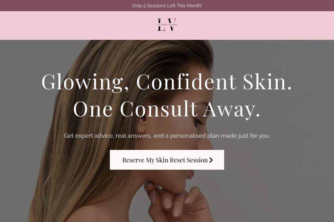
Discover the exact cause of your skin issues and receive a personalised game plan built by Gold Coasts leading skin experts, so you never waste money on generic facials again.
Summary:
Overall, the landing page effectively targets women aged 42 with clear messaging and visuals. The main value proposition stands out with clear benefits, like personalized skin plans and the emphasis on clinical expertise. There’s a strong use of testimonials and social proof, boosting credibility. However, the color scheme can feel a bit monotonous, and the typography could use more variety to better differentiate sections. The call-to-action buttons are consistent, but their verb-heavy nature could be more dynamic. The layout is generally clean, but some sections could be consolidated for brevity.
- Experiment with more dynamic verbs in CTAs for stronger engagement.
- Consider introducing subtle variations in colors to enhance visual segmentation.
- Use more varied typography to improve readability and focus.