kanan.co
Landing Page Analysis
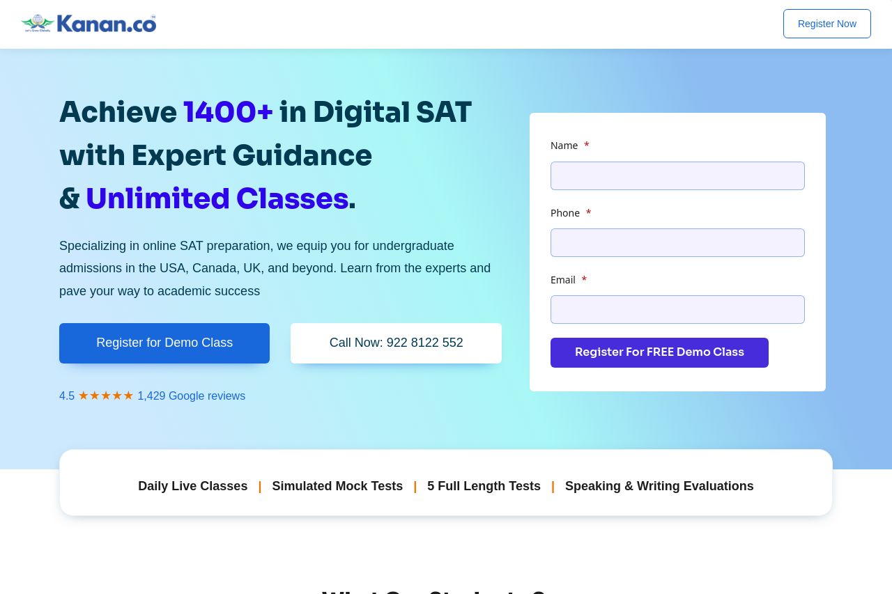
Specializing in online SAT preparation, we equip you for undergraduate admissions in the USA, Canada, UK, and beyond. Learn from the experts and pave your way to academic success

Summary:
The landing page for Kanan.co's digital SAT training is strong on several fronts but also has notable areas for improvement. The hero section effectively conveys a bold promise, "Achieve 1400+ in Digital SAT with Expert Guidance & Unlimited Classes," but the value proposition could be clearer. It does a good job presenting social proof immediately with Google reviews, which builds credibility right away. The design is clean, with a mostly consistent color scheme, though the call-to-action (CTA) buttons could stand out more. Readability and layout are decent, but some text elements could be simplified for quicker comprehension. Information is generally well-organized; however, there's a bit too much to read through without sufficient breaks, potentially overwhelming visitors. The use of testimonials in the "What Our Students Say" section provides real-world success stories, yet more detailed case studies could enhance this further.
- Emphasize CTAs with better contrast and placement.
- Simplify text with bullet points or subheadings to improve readability.
- Enhance the value proposition with clearer, benefit-focused statements.