polyfile.app
Landing Page Analysis
Seamless file management across SaaS apps
Summary:
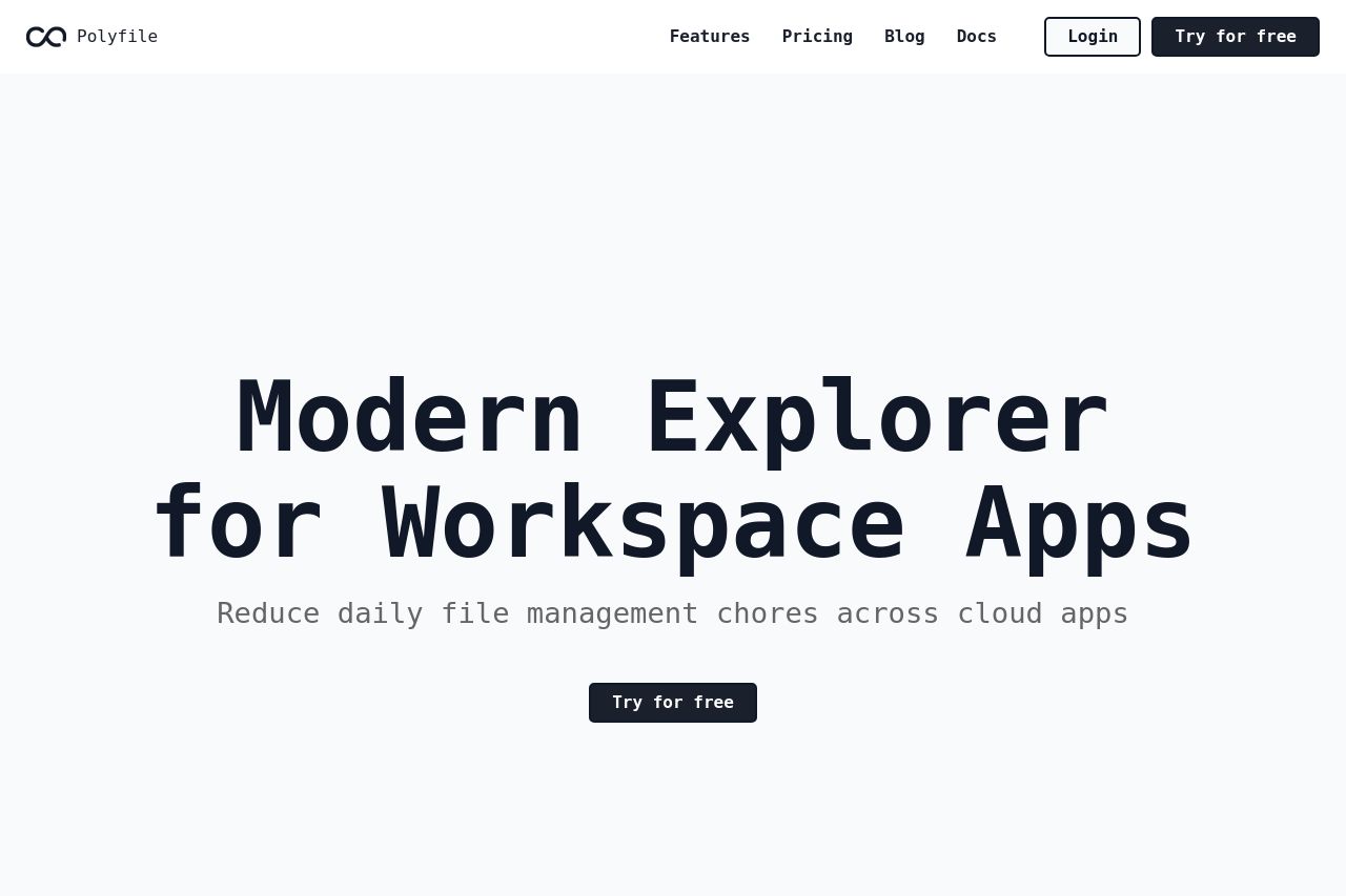
The page has a clean, modern design, but it's almost too minimal, leaving a lot of blank space that could be used more effectively. The main headline "Modern Explorer for Workspace Apps" is vague. It's not immediately clear what problem is being solved or why a user should care. Clarification is only vaguely offered in the subline, "Reduce daily file management chores across cloud apps," which still lacks punch and specificity. The CTA, "Try for free," is straightforward but placed in an awkward spot and doesn't provide any sense of urgency or specific benefit. Additionally, the header menu suggests more content (Features, Pricing, Blog, Docs), but none of it is directly visible, leaving a potential user unsure about the service specifics. It doesn't help that the Open Graph data isn't fully utilized here, particularly with no image to catch attention on social media. Overall, while the design is decent and professional, the page falls flat on communication and actionability, missing the opportunity to capture attention with a more compelling message or engaging design elements.
- Make the headline more specific and benefit-driven.
- Use the empty space for visuals or examples to illustrate the product's benefits.
- Improve CTA visibility and urgency by better positioning and perhaps adding a secondary CTA for alternatives.
- Add a brief explanation or visual of features directly on the page for clarity.
- Include social proof elements like testimonials or user reviews to build trust.