landingpage.report
Landing Page Analysis
Analyze your landing page against best-practice criteria and get actionable insights to boost conversions. Free comprehensive analysis covering speed, design, CTAs, and more.
Summary:
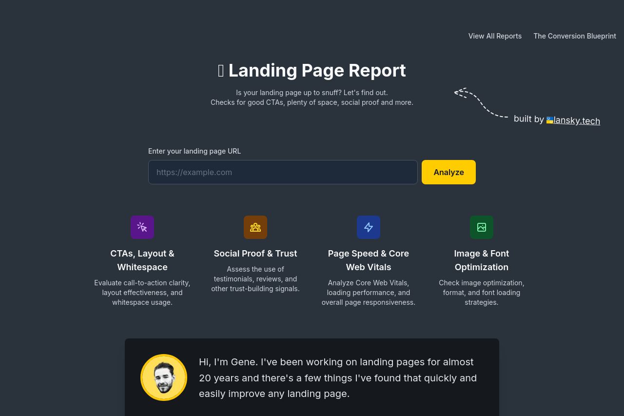
The landing page report has a solid foundation but misses the mark in a few key areas. The value proposition is clear with what it should provide, but it's not immediately exciting or engaging enough. Visual elements are consistent, but the layout feels a bit rigid because of the lack of engaging imagery or dynamic elements. Good use of whitespace improves readability, yet the typography suffers due to a lack of variation in font style and size, which can make readers lose interest. CTAs are clear, but there's not enough urgency or compelling reasons to hit the "Analyze" button. The page might benefit from a bit more personality or unique design elements to stand out. Overall, the structure is logical, but it doesn't grab and hold the attention as effectively as it could.
- Enhance the header area with a stronger visual or engaging element.
- Include more varied typography for better visual interest.
- Add urgency or scarcity to the CTAs to encourage action.