conos.hu
Landing Page Analysis
Simplify your project workflow with Conos. Easily share files, manage punch lists, and approve plans, ensuring efficient collaboration and project success.
Summary:
Overall, the Conos landing page effectively communicates its value proposition to construction professionals through clear messaging and a clean, professional design.
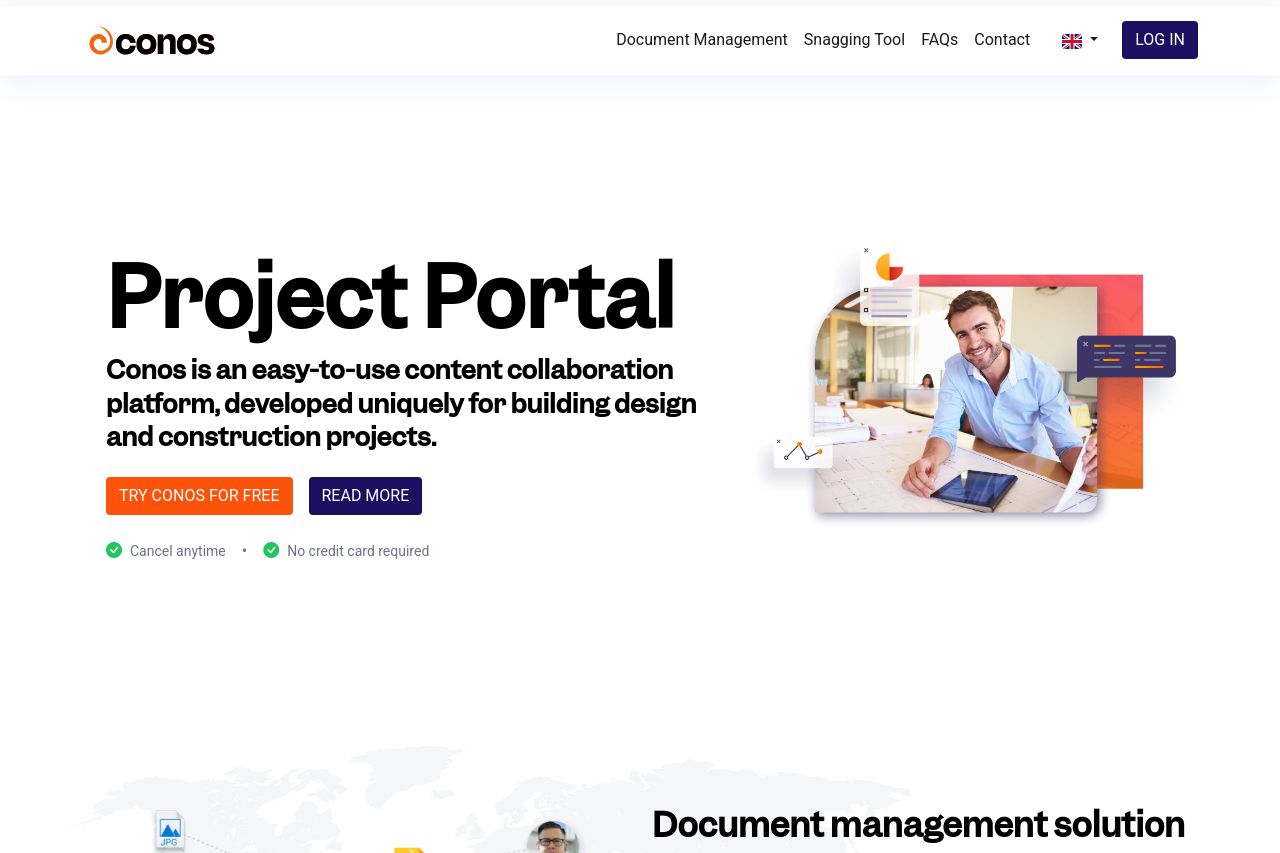
The page does a fantastic job of specifying that it’s a content collaboration platform designed for building design and construction projects. This immediately communicates the intent and audience, but it could emphasize benefits over features more explicitly to improve engagement.
Design-wise, the use of bold typography and contrasting colors makes key messages like “Try Conos For Free” stand out. However, there’s a noticeable lack of imagery diversity that could make the page more visually appealing. Most sections rely heavily on text, which might overwhelm users. Consider incorporating more visual demos or examples.
Structurally, sections are logically organized, aiding the skimming experience. The CTA buttons are prominently placed—good for guiding user actions—though they could be more varied to prevent fatigue from repetition.
On credibility, featuring client logos and a brief company introduction help build trust. However, testimonials are notably absent, a missed opportunity for enhancing credibility.
- Emphasize benefits over features in the main message.
- Incorporate more diverse and engaging images or visual elements.
- Add testimonials or case studies to enhance credibility and trust.