short-link.me
Landing Page Analysis
Segai,Innovation
Summary:
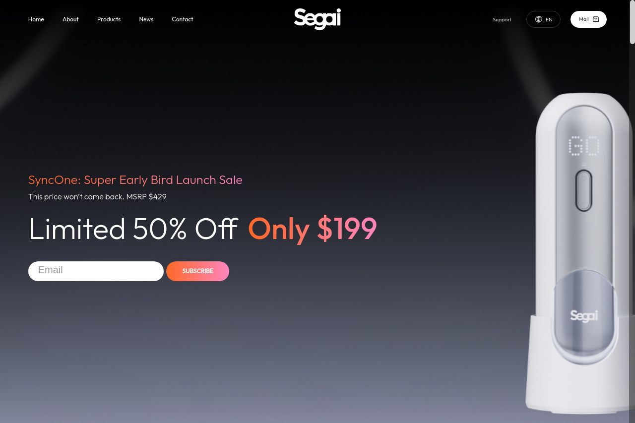
The website for Segai SyncOne is trying hard to stand out with its bold claims and innovative product features, but it falls flat in several areas. The visual hierarchy is mostly okay, with essential elements (CTAs, promotions) given prominence. However, the overall design lacks contrast, making it dull. The messaging is a mix of good and bad; while the pricing and product features are clearly stated, the language is inconsistent and tone sometimes comes off as too clinical for a consumer audience. The readability could use a boost, especially with the dense blocks of text that don't help user engagement. Actionability is average; although CTAs are present, they aren't compelling enough to provoke immediate action. Overall, the website has potential, but several areas need substantial improvement to genuinely connect with and convert its audience.
- Increase contrast between text and background for better readability.
- Revamp CTAs to be more engaging and urgent, such as 'Shop Now' instead of 'Subscribe'.
- Break text into more succinct, visually engaging chunks to improve readability and comprehension.