bfl.ai
Landing Page Analysis
Amazing AI models from the Black Forest.
Summary:
The landing page of Black Forest Labs does a decent job showcasing their FLUX.1 Kontext model, but it certainly falls short in several areas.
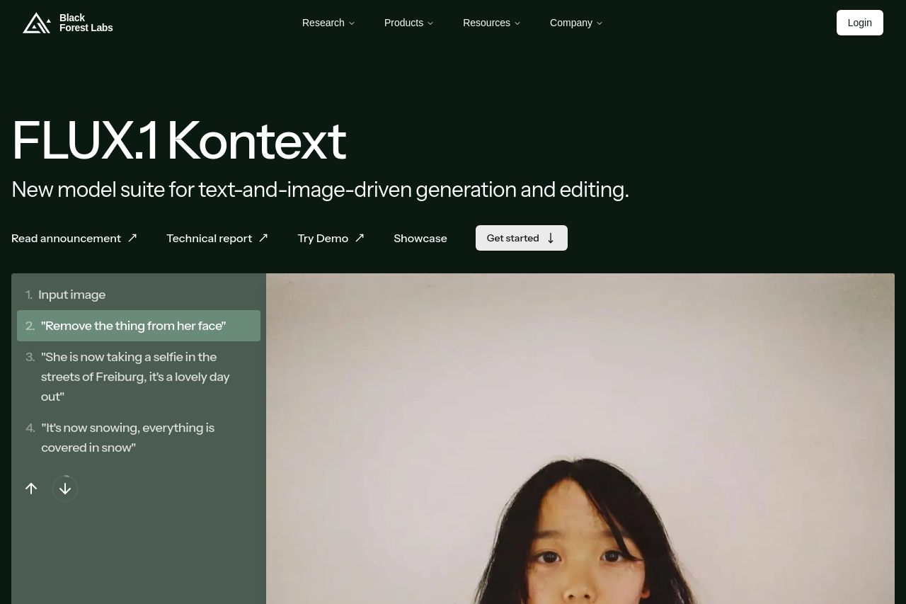
The hero section is bland, lacking any strong visual or textual hook to grab attention right away. The text is functional yet utterly forgettable. The image alongside doesn't convey the tech prowess I'd expect from a cutting-edge AI lab. While the minimalistic design is commendable, it almost feels like a cop-out — missing bold gravitas.
In terms of messaging, the benefits of the FLUX.1 Kontext are clear yet somewhat repetitive, as the same points rehash throughout the page rather than expanding the narrative. Readability is marred by dense text blocks that might turn potential users away.
Design-wise, the attempt at a sleek modern design is visible, but the middle sections become a zoo of images that lack cohesive storytelling or guiding direction. There's an overwhelming presence of visual elements competing for attention, detracting from the main features the page should highlight.
In CTA placements, it's a mix of indifference and inconsistency. I sense a severe lack of urgency or psychological nudges towards clicking that tempting button.
Lastly, credibility could use a hard push; trust elements like testimonials are nowhere to be found, making it feel like a rookie move for an established lab.
- Revamp the hero section with a stronger, more emotional headline and dynamic imagery.
- Introduce clear user testimonials or client logos to boost credibility.
- Add sub-headings or bulleted lists for better readability and to break up text.
- Enhance Call-To-Actions by making them more prominent and convincing.