evincedev.com
Landing Page Analysis
Summary:
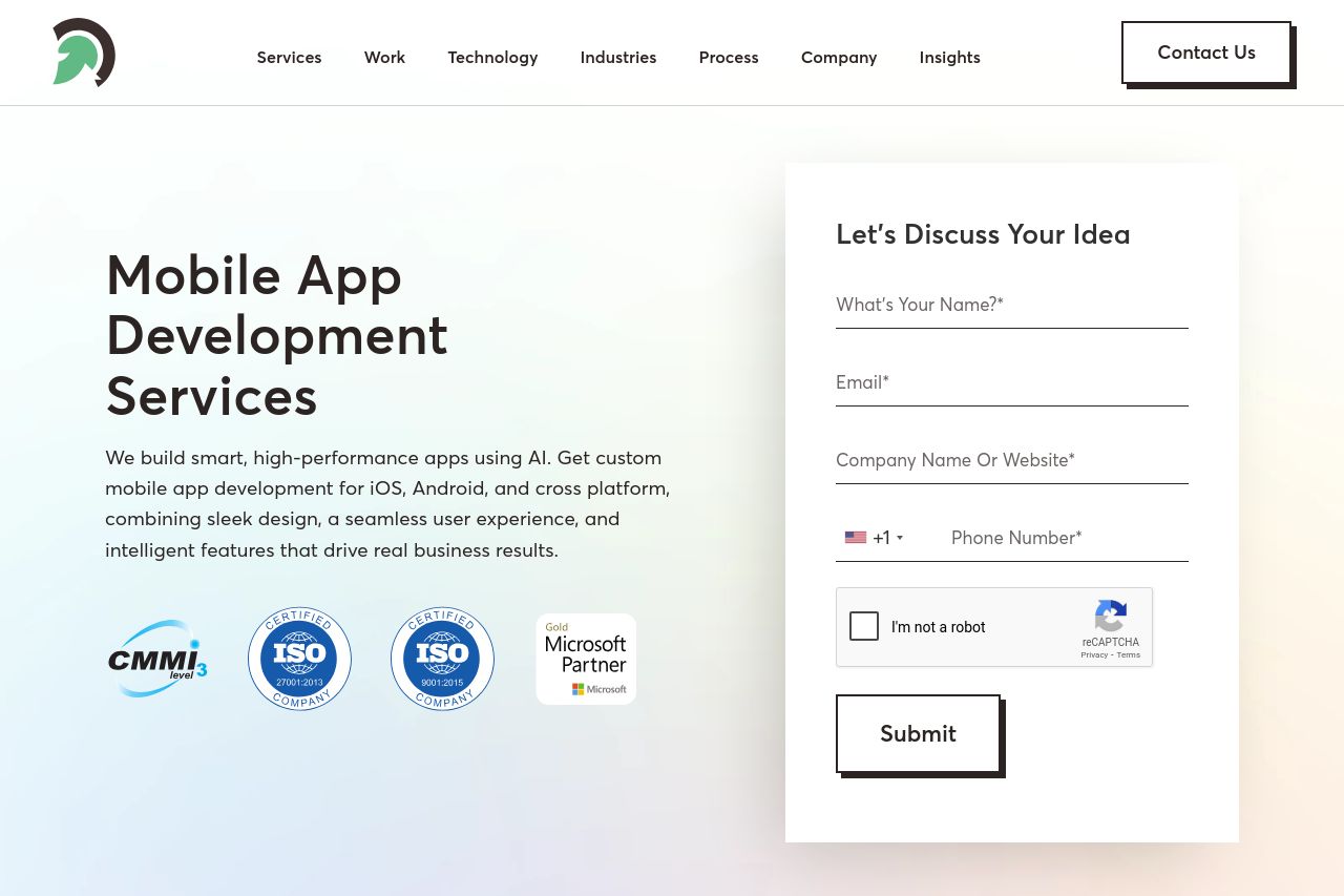
The landing page tries to establish credibility with numerous trust badges and certifications, which is great. However, it quickly goes downhill with weird metrics in the Why Choose EvinceDev section, like "0k+ Hours/M," which doesn't mean anything. Clear, real metrics would boost credibility.
The design is sleek but lacks a strong visual hierarchy. The top area is crammed with text and logos, and the images don't add much value. It seems cluttered and struggles to guide your eye through the important points effectively.
The call-to-action boxes, like "Book a Free Consultation," stand out, but are placed awkwardly. They seem desperate rather than inviting. The tone is overly formal and doesn't engage the audience at all. It feels too generic, stuffed with buzzwords without meaningful substance.
Overall, while consistency in branding and professionally looking elements provide some trust, the page is hampered by ineffective messaging and a cluttered design that doesn't guide the user's journey effectively.
- Clarify metrics in the statistics section for credibility.
- Improve CTA positioning to create a natural flow.
- Enhance visual hierarchy to make key points stand out.