auriic.co
Landing Page Analysis
Summary:
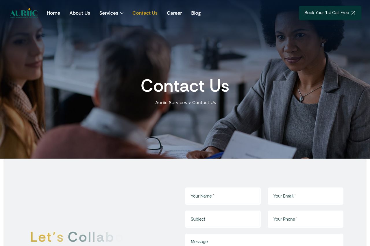
The page has some major issues that need addressing. The main value proposition of collaborating is weak and lacks clarity. Messaging does not align well with the target audience, causing disconnection. While the professional tone is maintained, the bland imagery and lack of dynamic content make it feel uninspiring. The readability is decent but could improve with more engaging, simplified text. The design's visual hierarchy could be stronger, with better use of color to emphasize key elements like the Call to Action. The structure has a logical flow, but navigation is hindered by poor CTA placement. Credibility is bolstered by recognizable logos, yet more persuasive social proof elements like testimonials are missing. Overall, the page lacks focus and fails to create a compelling reason for engagement.
- Clarify the main value proposition with specific benefits for prospective clients.
- Improve CTA visibility with contrasting colors and action-oriented language.
- Add customer testimonials or success stories for enhanced credibility.