evincedev.com
Landing Page Analysis
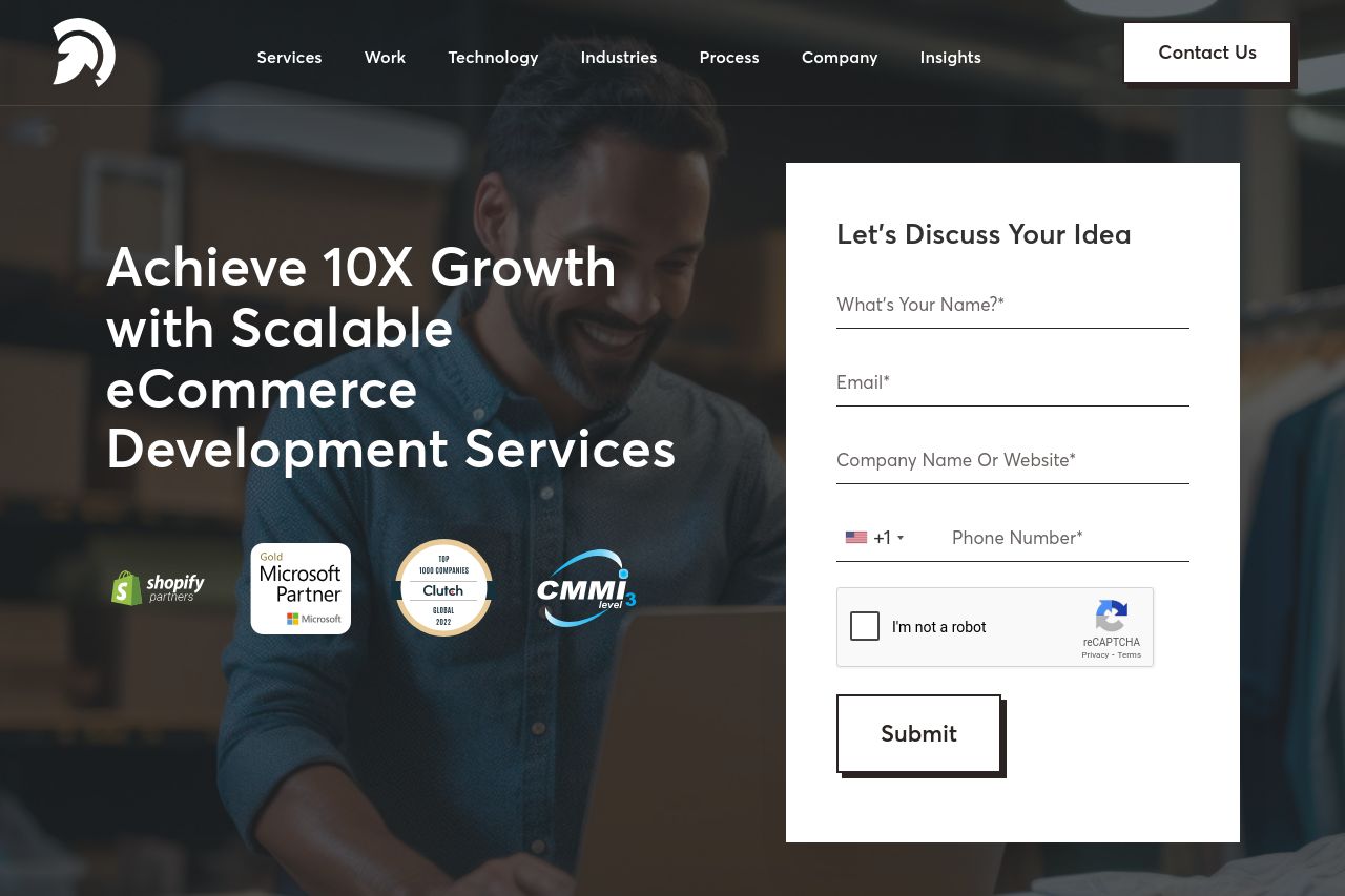
Summary:
The landing page excels in professional and streamlined design, effectively communicating the company's capabilities and expertise in eCommerce development. The use of logos and trust badges builds immediate credibility, and the overall layout feels polished and modern. However, the call to action elements are somewhat lackluster and fade into the background, missing opportunities to grab user attention. There is a lack of urgency or uniqueness in the CTA phrases, which could be improved. While the layout is clean, the content lacks depth in some areas, and the value proposition could be more persuasive. Although the structure is generally well-organized, some sections feel repetitive.
Overall, the site comes off as professional but needs a bit more punch to convert visitors effectively, especially in its call to action strategy and messaging clarity.
- Enhance the CTAs to make them more compelling and action-oriented.
- Improve the clarity and persuasiveness of the value proposition.
- Add more specific client-focused content or case studies to increase engagement.