aklify.com
Landing Page Analysis
Portfolio website showcasing our work
69
Share on:
Summary:
55
Messaging
85
Readability
70
Structure
60
Actionability
80
Design
40
Credibility
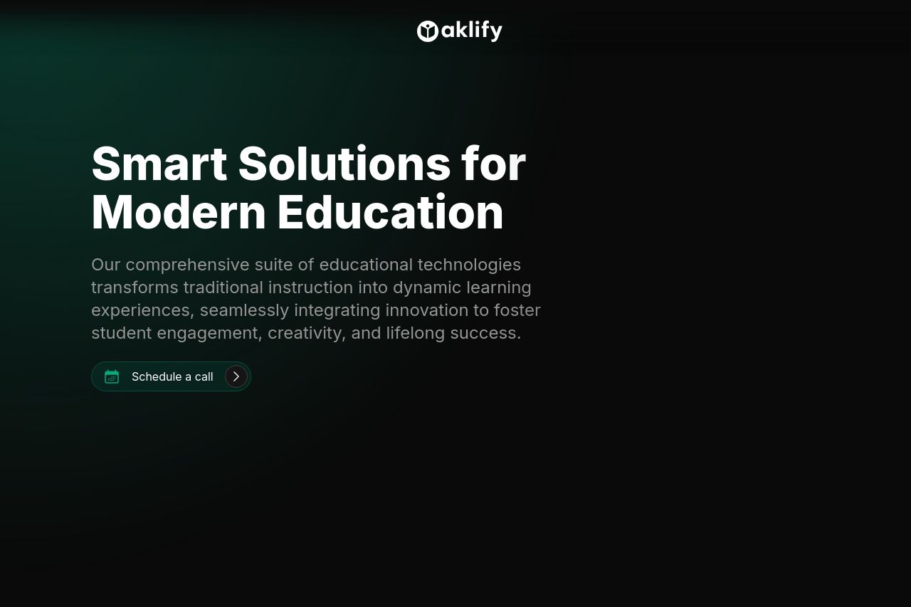
The page is trying hard to look sleek and modern but falls short on some fronts. The message is halfway there in highlighting the benefits of modern education solutions but gets bogged down in jargon. The overall structure is simple to navigate, but it could lose casual visitors with its overly technical tone. The call-to-action is visible, but not exactly enticing or urgent. The design feels a bit too plain and misses an opportunity to make a real impact, leaving it feeling generic rather than tailored.
Main Recommendations:
- Simplify the jargon and make the language more engaging.
- Enhance the visual impact of the CTA to drive action.
- Add more personality to the design to make it less generic.