ideahe.ro
Landing Page Analysis
Generated by create next app
Summary:
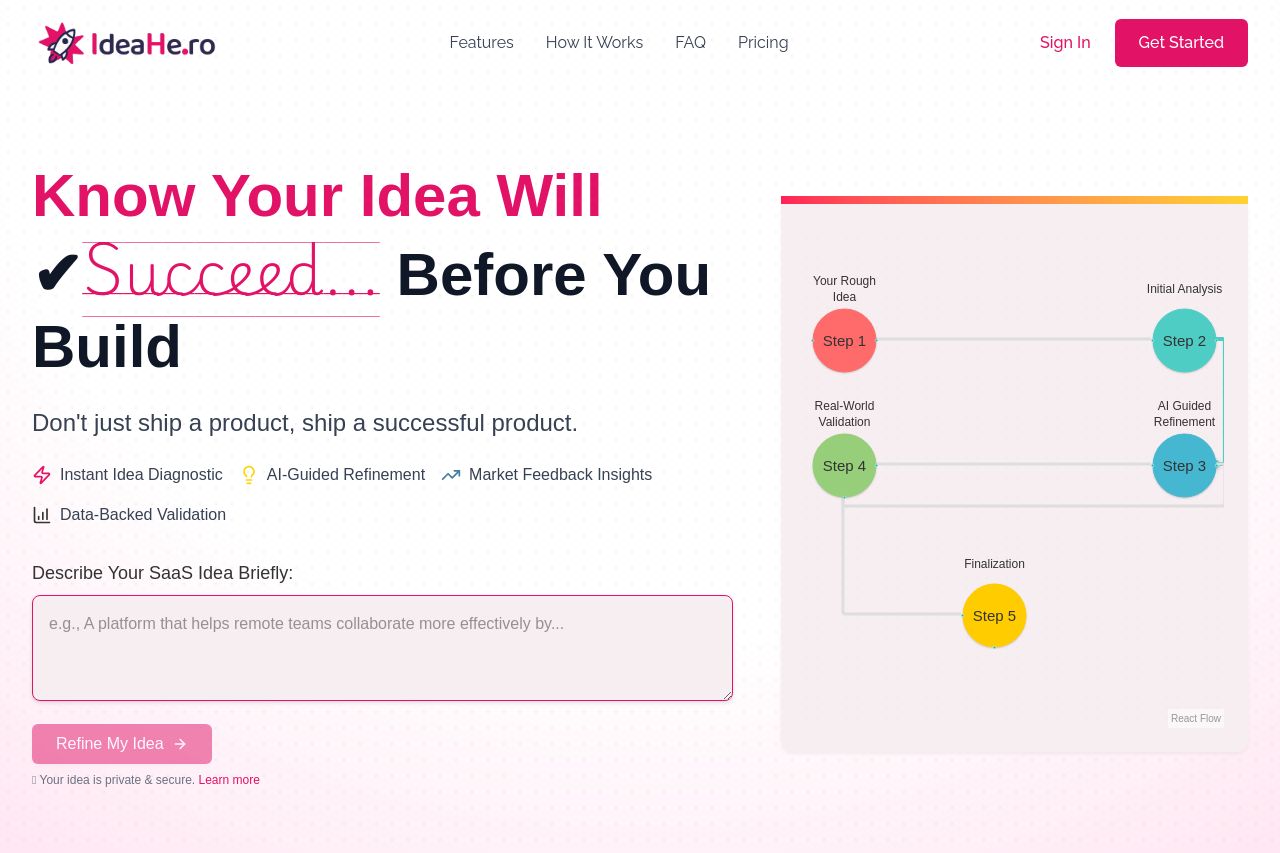
The landing page for IdeaHe.ro does a decent job of explaining its value proposition, but it is somewhat repetitive and lacks concise communication. The hero section is bold but cluttered, losing clarity with its complex layout and excessive text. Several CTAs are present, yet they aren't differentiated well enough, blending into the rest of the page rather than standing out. The design elements are fairly consistent, but the visual hierarchy could use improvement to enhance readability and focus the user’s attention on key areas. There is a clear attempt at appealing to entrepreneurs and SaaS founders, yet the language is too verbose at times, which might not resonate with a target audience that values concise communication. Social proof is delivered through the portrayal of a structured process, but the absence of recognizable client logos or substantial testimonials may hurt credibility. On the positive side, there’s ample explanation about their processes, but it borders on being overwhelming, with too much detailed information upfront.
- Refine the main value proposition message to be more concise and impactful.
- Differentiate CTAs by making them more visually distinct from other elements.
- Simplify the textual content to improve readability and focus, especially in sections that are too verbose.