nazarovbms.com
Landing Page Analysis
Rejuvenece tu rostro de forma natural con el lifting muscular Nazarov BMS. Sin cirugía, resultados desde la primera sesión.

Summary:
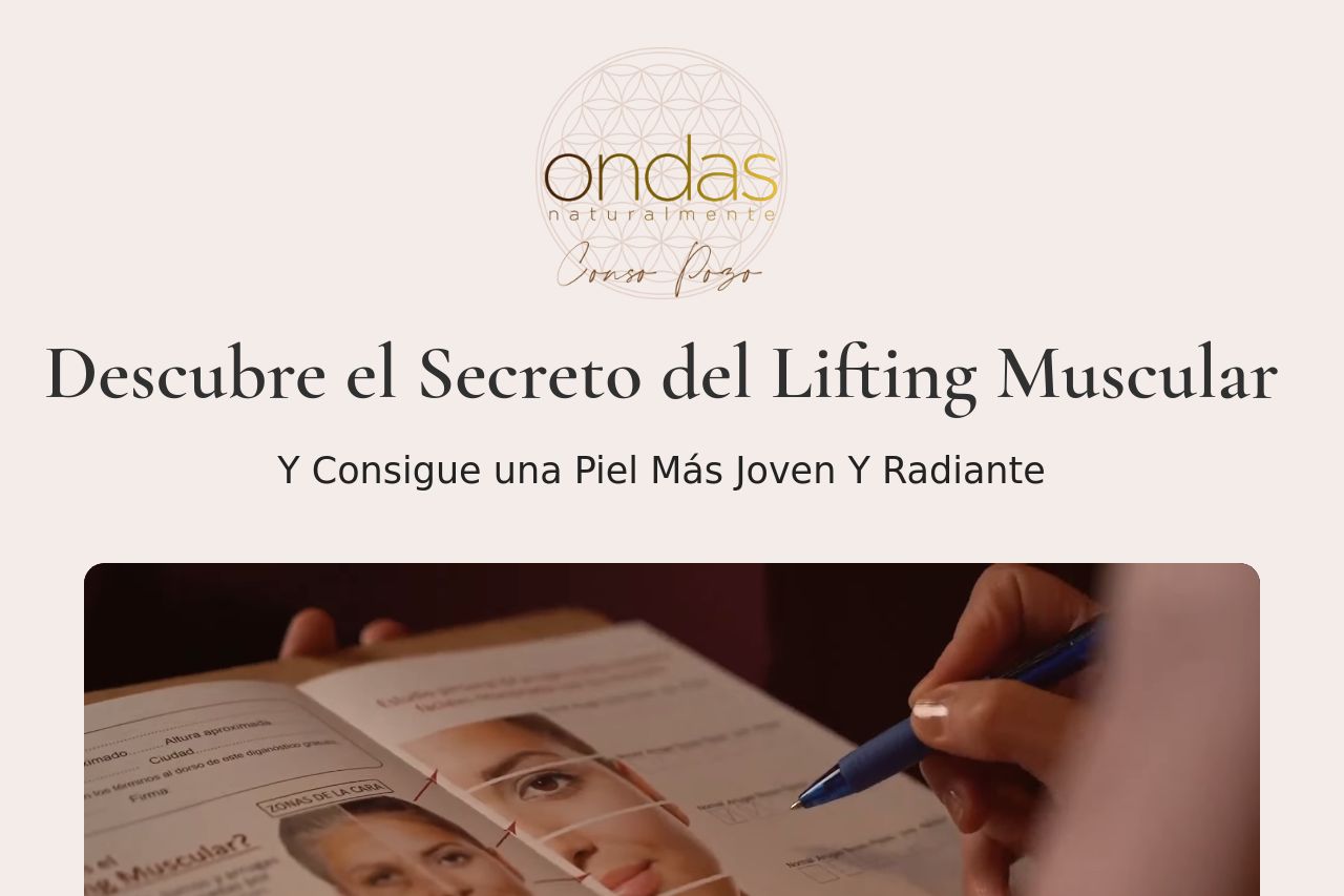
The landing page delivers a well-structured narrative but falls short on several critical fronts. Yet, the value proposition is somewhat clear, outlining the promise of youthful skin without surgery. However, it lacks engaging elements such as interactive previews or demos that could further entice potential clients. The audience is implied but never explicitly addressed, leaving some ambiguity as to whom exactly this service is targeted. The tone maintains a professional edge but occasionally drifts into dryness, resulting in a failure to captivate. Readability could benefit from simplification, as some sentences feel cumbersome, resulting in decreased engagement levels. Visually, the layout is simple with effective use of color contrasts, though it borders on blandness in parts. Design is consistent yet uninspired, missing opportunities for stronger visual hierarchy to make crucial points pop. CTAs are present but aren't attention-grabbing, suffering from subpar prominence and confusing placement in sections. On credibility, there's a solid groundwork with testimonials and personal stories, but the site needs a boost in visible assurance elements to project heightened trustworthiness.
- Make the value proposition more compelling with benefits and engaging elements like demos.
- Enhance audience clarity by explicitly stating who can benefit from the service.
- Revamp CTAs to be more prominent and action-oriented with clear placement.
- Simplify text to enhance readability and engagement.
- Add more social proof elements like badges or partnerships for increased credibility.