addmarc.com
Landing Page Analysis
We take the service we provide to our clients very seriously, and we start every engagement by establishing a thorough understanding of the client’s ambitions and goals. At Addmarc, we are committed t
Summary:
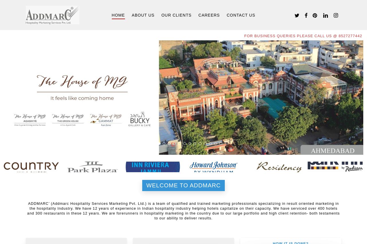
The landing page relies heavily on a generic presentation style typical for corporate sites but lacks clear and engaging communication. The hero section is overcrowded with a rotating banner that adds unnecessary noise. The copy, while detailed, fails to strike a strong value proposition quickly. CTAs like "Read More" lack specificity and action-oriented language, blending into the background rather than encouraging interaction. The design feels outdated, with sections not standing out due to poor visual hierarchy and inconsistent font usage. Social proof is utilized well through client logos, yet transparent trust badges or testimonials are absent, missing the mark on credibility.
The "Our Commitments" section provides dense text that could benefit from bullet points or highlights to improve readability. Contact options are visible, yet there's no live chat feature that modern users often expect.
Overall, the page could do with a modern aesthetic update, clearer CTAs, and a more engaging narrative tailored to hotel owners needing marketing solutions.
- Simplify and highlight the main value proposition more prominently in the hero section.
- Update the design to be more visually appealing and modern, focusing on a clear visual hierarchy.
- Enhance CTAs to be more action-oriented and specific, drawing immediate attention.