hubspot.com
Landing Page Analysis
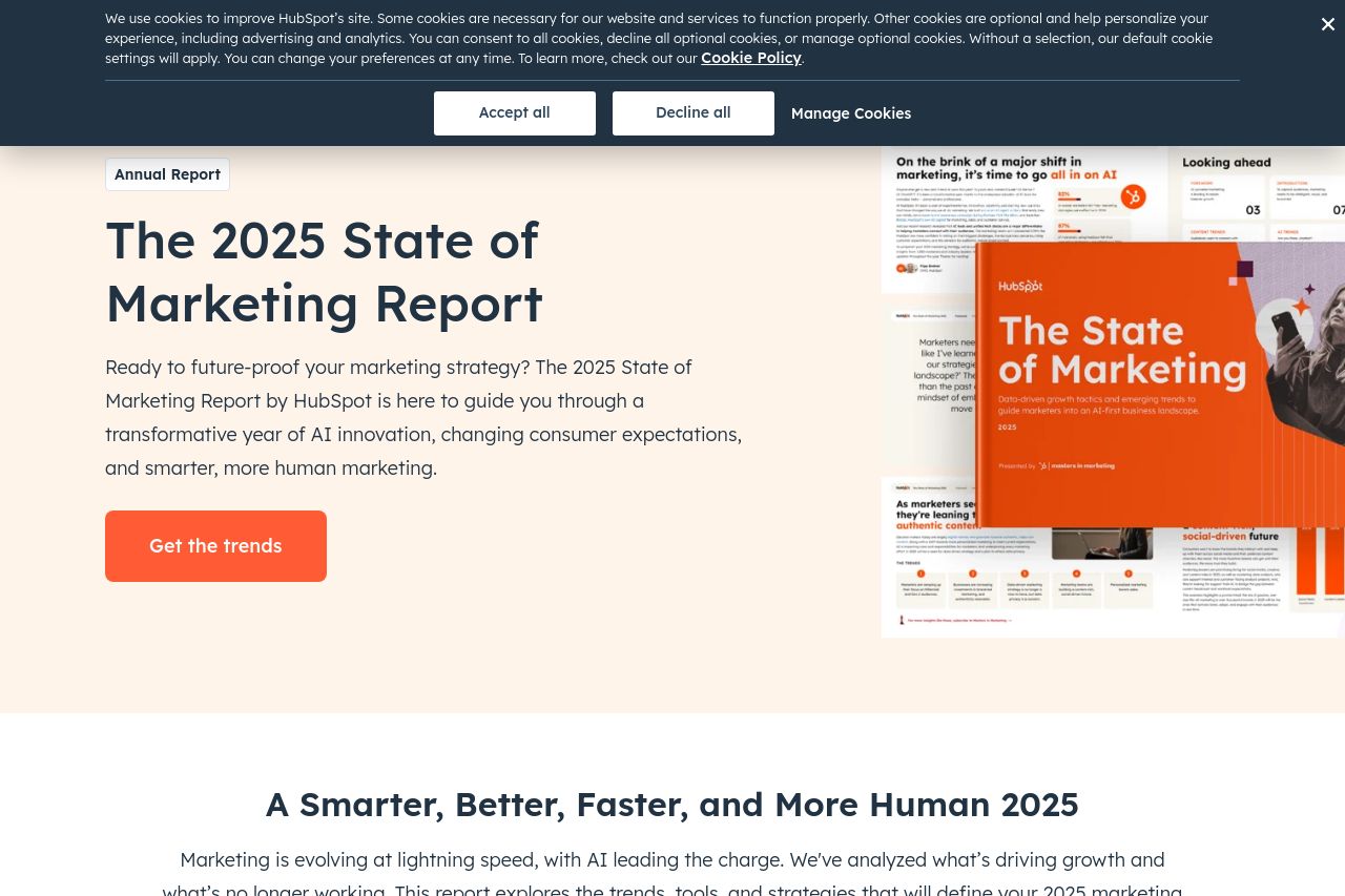
A report featuring data from 1,200+ global marketers packed with insights for 2025!
Summary:
The landing page is strong in several areas but falls short of aligning perfectly with its goals. The main value proposition is communicated effectively, particularly in the hero section, by enticing users with trends in marketing. The tone is consistent and professional, matching the target audience of marketers and businesses. The page's design is visually appealing, maintaining consistency in its use of colors and typography. However, the CTA could be more action-oriented and less redundant. Structurally, the website is mostly logical, but certain sections feel redundant. The readability is satisfactory, but could be enhanced with reduced text density and more distinct typography. Overall, while the presentation is professional, the page could better engage users by sharpening its CTAs, simplifying content, and enhancing readability.
- Make the CTA more action-oriented with specific verbs.
- Reduce redundancy in sections to streamline user experience.
- Enhance text contrast and break long paragraphs for better readability.