bmed.uz
Landing Page Analysis
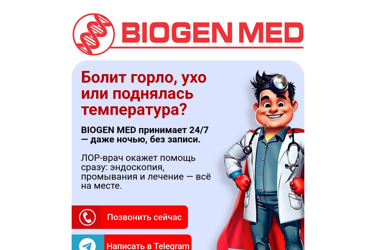
Ищите Круглосуточный ЛОР 24/7 в Ташкенте? Приходите в BIOGEN MED
Summary:
The landing page for BIOGEN MED effectively communicates its key value proposition: 24/7 medical services without appointment, making it quite attractive for potential customers.
However, the design lacks sophistication and creativity. A cartoon doctor may not resonate well with the intended audience, which can diminish credibility. The color scheme is consistent but unimaginative, relying heavily on red, possibly overwhelming users.
The call-to-action buttons are clear and easy to find, though there's potential for improvement in placement and text. Most information is upfront, assisting quick decision-making, but long blocks of text could deter engagement. The typography, while readable, is too simplistic and could use tweaks to enhance visibility.
There's an adequate structure with necessary information, but the messaging is slightly generic, and could benefit from more emotional appeal or specificity to build trust. Testimonials or reviews could further enhance credibility.
- Revise the design to look more professional and less cartoonish.
- Improve the emotional appeal in the messaging to connect with visitors.
- Add testimonials or reviews to build trust.
- Enhance the typography for better visibility and engagement.
- Reconsider the color usage to ensure it doesn't overwhelm the viewer.