myscalev.com
Landing Page Analysis
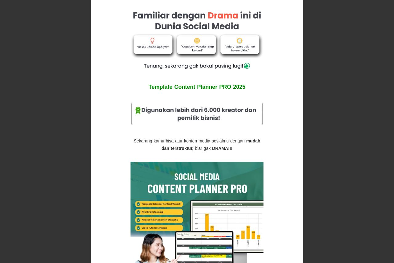
Template Content Planner PRO 2025
Summary:
The landing page for Template Content Planner PRO 2025 provides a straightforward and visual experience, but it lacks depth in its messaging. Bold colors are used to highlight key elements, but the overall visual hierarchy can be improved to enhance readability. The social proof with testimonials adds credibility, yet the design aesthetics could be more refined to avoid looking cluttered. The call-to-action buttons are present but don't stand out enough, which might affect conversion rates. Grammar and clarity remain concerns as the language seems too informal at times. While the offer appears beneficial, it might be more convincing with clearer demonstrations of value, such as case studies or user stories.
- Improve CTA visibility by using contrasting colors.
- Clarify the main value proposition at the top.
- Enhance visual hierarchy to improve readability.