geekforbiz.com
Landing Page Analysis
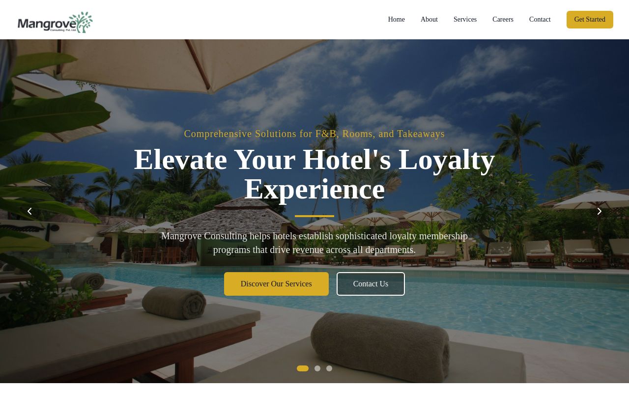
Helping hotels establish loyalty membership programs for increased market penetration
Summary:
The landing page is trying to cater to hotel owners with its focus on revenue maximization through loyalty programs. The value proposition is a bit vague, and the homepage bombards visitors with too much information, which could overwhelm rather than inform. The color scheme is cohesive, with gold and blue giving a professional touch, but the visual hierarchy could be stronger to better guide the user's eye. The CTAs, like "Get Started" and "Schedule a Consultation," stand out, though their effectiveness might be diluted by how inundated the page is with detailed explanations and elements. The credibility is bolstered by client logos and specific numbers, yet the text-heavy sections could put some visitors to sleep before they spot those social proofs. Overall, the foundation is solid, but polishing the messaging and visuals could make it truly shine.
- Simplify the value proposition to make it clearer.
- Reduce text density to prevent overwhelming visitors.
- Enhance the visibility of key sections through stronger visual hierarchy.