frank-astor.com
Landing Page Analysis
Der Bühnenprofi Frank Astor begeistert seit Jahren als inspirierender Keynote Speaker, Moderator & Entertainer. Über 1,5 Millionen Zuschauer!
Summary:
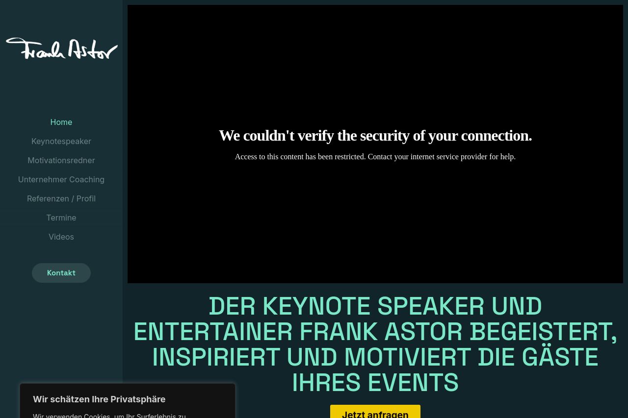
The website struggles with clarity and functionality. The initial issue is a significant one: the video cannot be played due to security verification problems, which disrupts the user experience right from the start. Despite some bold text and standout headings, the overall presentation lacks balance. There's an over-reliance on a dark color scheme, which doesn't always effectively enhance focus on important elements. The repeated cookie consent notification is invasive and doesn't disappear, creating a frustrating user experience.
Visuals and layout need refinement. While images are used consistently, they're cluttered and don't always contribute to conveying the speaker's message effectively. Some images, like the hero and profile pictures, could benefit from better integration into the design rather than being just fillers. Typography is straightforward but could do with more dynamic spacing and size choices to elevate interest and legibility.
The social proof is strong with testimonials and appearances in images, but the key message of what exactly is on offer isn't communicated effectively. Actionable content is hidden under language-heavy sections, demanding more concise and engaging content strategy. The CTA lacks urgency and strategic placement, making it easy to overlook.
Consistency is present but unremarkable. Although there's a coherent brand presence, the navigation feels basic and outdated. This site needs a structural revamp to guide the user's journey more effectively.
- Fix the video loading issue to prevent a negative first impression.
- Improve CTA visibility and placement throughout the page.
- Revise the color palette to create more contrast and focus on important elements.