thatsnowsky.com
Landing Page Analysis
VFX Artist & Photographer from Singapore. Bringing fantasy to reality for you.
Summary:
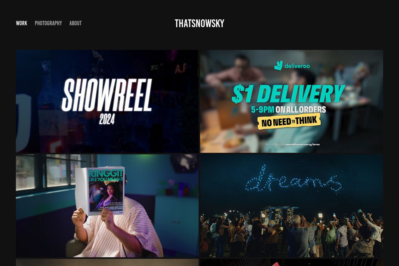
The landing page for ThatSnowsky struggles in terms of clarity and user engagement despite an impressive showcase of work. The messaging lacks a clear and cohesive value proposition that adequately explains what the user can expect. Instead, there's a sea of colorful images, enticing but overwhelming, leaving visitors unsure of the primary action to take.
Design-wise, it's a mixed bag. While the page is visually rich with creative content, it lacks a strong visual hierarchy, causing important information to be easily lost or overlooked. The color scheme is cohesive but doesn't do enough to guide the viewer's eye or highlight particularly essential sections, leading to potential cognitive overload.
In terms of credibility, the lack of transparency and trust elements is concerning. No contact information is readily available, and there's a glaring absence of social proof like testimonials or featuring recognizable partners, which can be a dealbreaker in professional fields like VFX and photography. Also, professionalism is slightly hampered by the layout, which feels cluttered and unstructured at times.
Actionable elements like CTAs are similarly buried. They lack distinction and fail to provoke immediate engagement. Without strong CTAs, the site's utility and potential for conversion are notably hindered, lacking prominent placement and a decisive call to action.
Ultimately, there's an untapped potential here, stifled by insufficient structure and focus. Enhanced focus on organizing and communicating key messages, a balance of visual distractions, and increased credibility markers would drastically boost effectiveness.
- Clarify the value proposition on the homepage with a concise headline and subheadline.
- Add clear and visible CTAs to guide users toward key actions like contacting or exploring specific services.
- Improve visual hierarchy by using varied font sizes and weights to highlight key sections.
- Incorporate social proof and trust elements like client logos or testimonials.
- Provide easily accessible contact and social media information to bolster transparency and trust.