meglionaturale.it
Landing Page Analysis
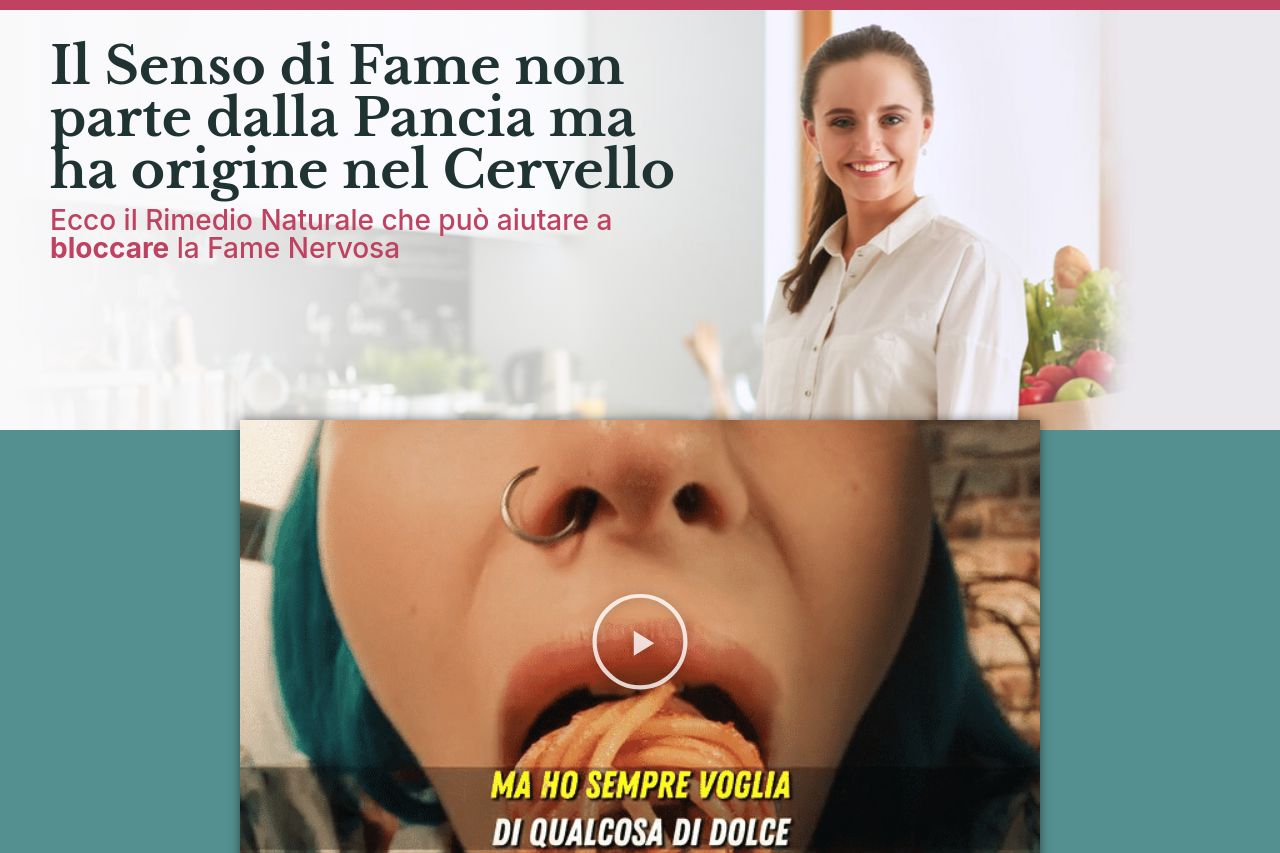
Le mie pazienti mi dicono spesso cose come “E’ una vita che sono a dieta”, “Ho sempre fame”, oppure “voglio perdere peso ma ho sempre voglia di qualcosa di dolce”, o ancora “non so come fermare la fam
Summary:
The page is filled with details and personal anecdotes but falls short in engaging potential customers effectively.
The messaging tries to create a sense of trust by mentioning medical experience, yet it feels too self-centered and doesn't clearly outline product benefits until much later. It's not directly addressing the audience's needs or pain points from the start, resulting in a disjointed narrative.
Readability suffers with long paragraphs and technical explanations that might confuse the target audience, who simply wants a solution for weight control.
Design-wise, the site's layout is cluttered, with inconsistent typography and color use. This reduces clarity and makes it difficult for readers to find critical information quickly. There's also a lack of visual emphasis on key messages or calls to action, leading to poor conversion focus.
The credibility aspects are emphasized with testimonials and scientific references, but they are buried deep in the text, losing their impact. Positioning these elements more prominently could enhance trust.
Overall, the site attempts to pack in too much information without a clear, engaging structure, diminishing effectiveness in driving user action.
- Streamline the content to focus on key benefits and values upfront.
- Improve visual hierarchy by better use of typography and colors.
- Place testimonials and trust signals more prominently to build credibility.
- Simplify the language to match the audience's needs and level of awareness.