spirulinapure.shop
Landing Page Analysis
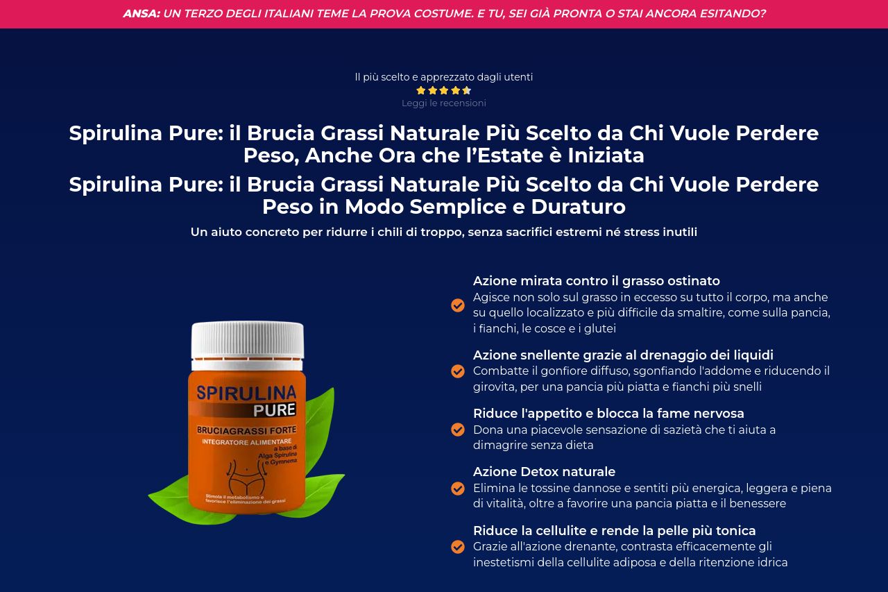
Spirulina Pure - La soluzione naturale per dimagrire
Summary:
The landing page for Spirulina Pure is a mixed bag.
On the positive side, it showcases clear value propositions and a consistent call-to-action throughout. The audience is clearly targeted – people aged 30 to 60 who wish to lose weight – and the message is simple: a natural solution for weight loss. Testimonials and social proof are well integrated, aiming to build trust.
However, there are several issues. The design is cluttered and lacks a refined visual hierarchy, making it hard for users to digest information smoothly. The repeated call-to-action sections can feel overwhelming and forced, losing potential urgency. The imagery and color choices are adequate but could align better with a wellness theme through the use of softer colors and imagery.
The tone is casual but needs adjustment to resonate more deeply with the target audience's motivations and challenges. The sections could flow better as content jumps around, disrupting the narrative flow. Moreover, the use of bold claims might feel overpromising without enough clear scientific backing or specifics, which risks harming credibility.
- Simplify the design and improve visual hierarchy to guide users naturally through the information.
- Refine and tone down the urgency messaging to feel more authentic and less spammy.
- Use softer color schemes and imagery that better convey a sense of wellness and natural beauty.
- Ensure all sections align consistently to build a compelling story and smooth user experience.