pipeorganmap.com
Landing Page Analysis
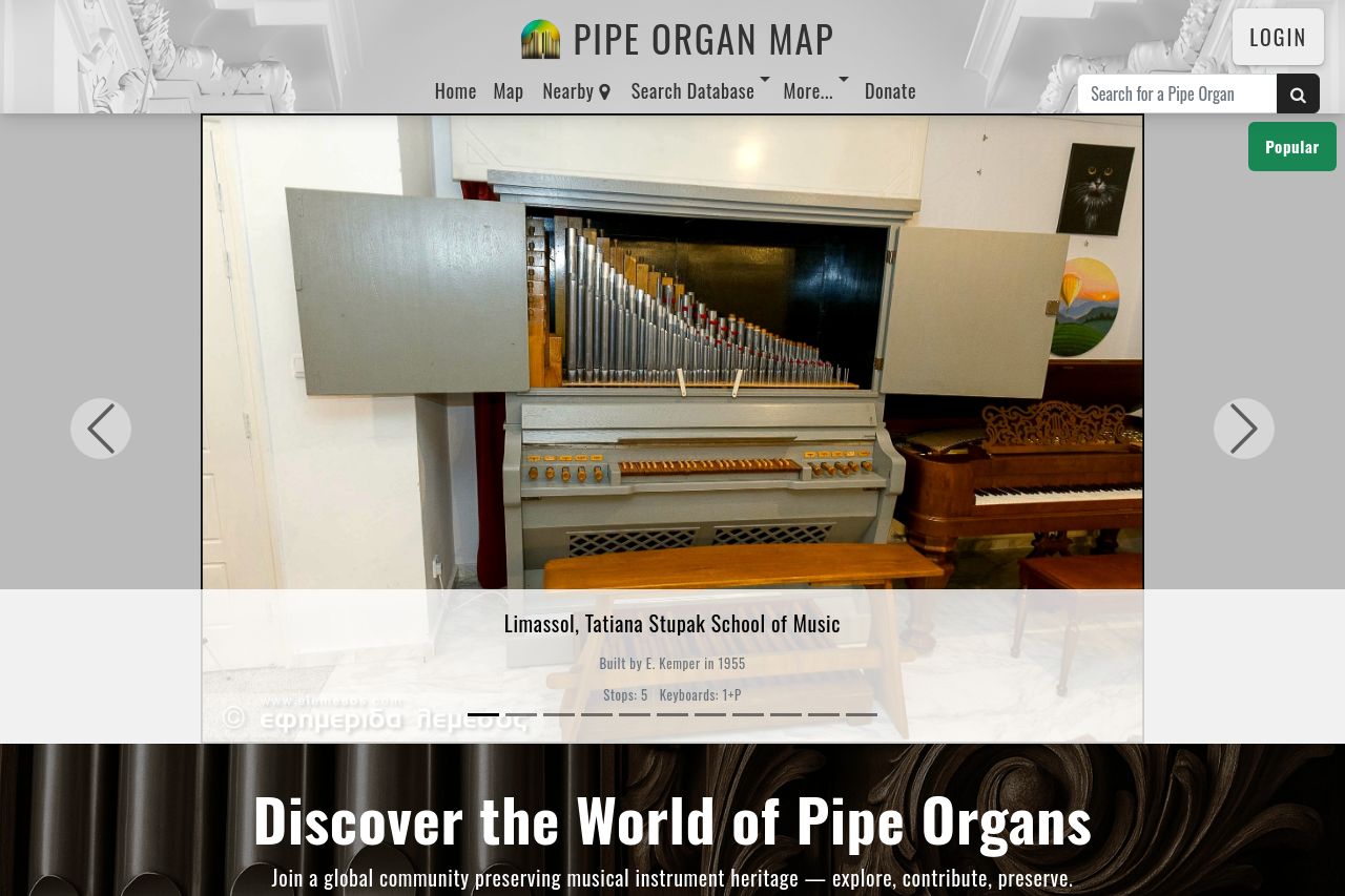
Explore and contribute to Pipe Organ Map — the free international database with interactive map, stoplists, photos, and builder info.
Summary:
Overall, the Pipe Organ Map page is well-structured to attract a specific niche audience of pipe organ enthusiasts. The visual layout is inviting, with the main value proposition highlighted through headlines like "Discover the World of Pipe Organs," which clearly communicates the site's purpose. The map and list elements are user-friendly, engaging users to explore. A mix of images, text, and interactive elements like maps successfully engage visitors' attention.
However, the overall tone and style need refinement. While the tone is suitably inviting for enthusiasts, it lacks the depth to fully engage its potential audience. The contrast between text and background is generally effective, although some sections, particularly with lighter backgrounds, lose impact. The consistency in design is notable, with a cohesive use of fonts and images reinforcing this.
The language is well-suited for the intended audience but could benefit from tightening to enhance readability and engagement. A more persuasive call to action could drive more contributions and interaction with the site. The visuals are largely supportive but could leverage the historical and musical significance of pipe organs more effectively.
- Enhance CTA engagement by using more persuasive language, e.g., "Join our Community" instead of "Join and Contribute today".
- Increase contrast in sections where the text blends with the background to improve readability.
- Add more immersive visuals or historical context to engage enthusiasts.