gbpn.com
Landing Page Analysis
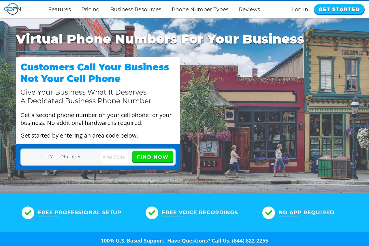
Customers call your business. Not your cell phone. Get a dedicated business phone number. Use your existing cell phone. No additional hardware is required.
Summary:
The landing page for virtual business phone numbers is clear but lacks some pizazz. The main value proposition is straightforward, telling visitors they can get a separate business number using their existing phone, without needing additional hardware. However, the repetition of "Customers Call Your Business, Not Your Cell Phone" quickly loses impact due to overuse. The design is mostly consistent and uses bold colors that are engaging, though it sometimes feels overwhelming. Readability isn't optimal; some text sections are unnecessarily long, making them tedious to digest. CTAs like "Find Now" and "Claim Number" are prominent but could be more varied and specific. While credibility is solid with testimonials and trust markers, the general tone could use some polish to build a stronger connection with small business owners.
- Diversify CTAs with more specific, action-oriented texts.
- Break up text into more digestible chunks with bullet points or subheadings.
- Add more visual examples or imagery to better showcase product use cases.