testit.so
Landing Page Analysis
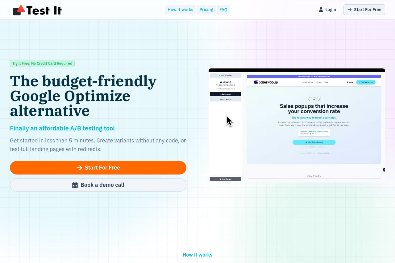
Create experiments in just a few clicks and start improving your conversion rate today. No coding required. Want to be sure your landing page converts? Test it!

Summary:
Overall, the landing page for Test It presents important information effectively, but there are areas that need improvement.
The hero section quickly communicates the service as a budget-friendly Google Optimize alternative, but the CTA "Start For Free" is duplicated unnecessarily, which could confuse users. The "Book a demo call" CTA doesn't stand out well due to its similar styling to other elements.
The page maintains a consistent design throughout. However, the typeface could use differentiation to enhance readability and hierarchy further, especially in sections with denser text.
The inclusion of testimonials gives credibility to the platform, but more specific data or personal anecdotes within these testimonials could build trust more effectively. The use of a repeating grid background doesn’t add much value and might come off as outdated.
The structure of the content logically flows from introducing the problem to features and solutions, yet the repetitive nature of some sections like multiple CTAs can feel overwhelming.
Credibility is bolstered by clear use cases and identification of the founder, but more varied and detailed social proof could help. The Open Graph image enhances intrigue, but the headline could be more direct about the specific benefits."
- Improve typography by using varying sizes and weights to distinguish headings better.
- Simplify and emphasize the main CTA, possibly reducing duplication to avoid user confusion.
- Enhance social proof with more detailed testimonials, including specific metrics or stories.