freetoolsland.io
Landing Page Analysis
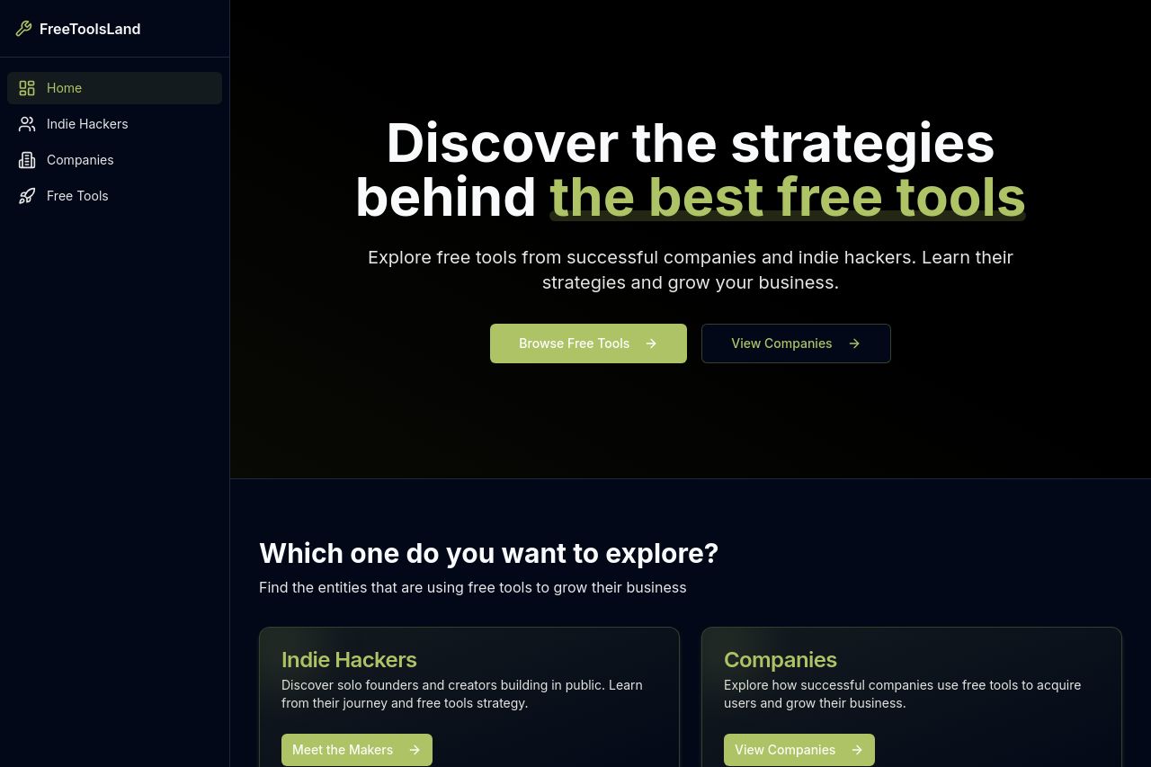
Explore hundreds of free tools from successful companies and indie hackers. Learn their strategies and grow your business with our curated collection.
Summary:
The landing page does a decent job of introducing its purpose – to provide insights into free tools for indie hackers and companies. The headline is striking, using the words "best free tools", which can draw attention. However, the message could use more clarity about what specific tools or benefits users can expect. Navigation seems straightforward, with links clearly presented, but the dark color scheme might hinder readability for some. The call-to-action (CTA) buttons like "Browse Free Tools" and "View Companies" are well-placed but lack urgency and standout design. Social proof elements are missing, which could improve trust and credibility. Overall, the design is cohesive but lacks the pizzazz needed to really hook users right away.
- Add testimonials or user reviews to build trust.
- Make CTA buttons more visually distinctive.
- Include more detailed previews or demos of tools.