totaltrenz.com
Landing Page Analysis
Get the best shopping experience. Enjoy great deals and a large selection of products. Buy quality. Shop smart.

Summary:
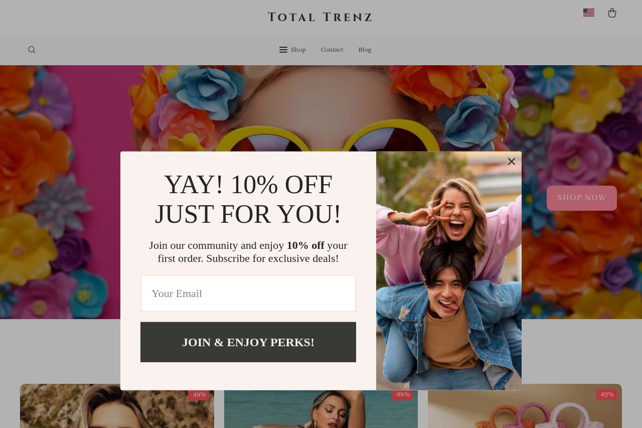
Total Trenz is a visually appealing e-commerce site that aims to combine vibrant imagery with stylish product offerings. The overall aesthetic is engaging with a colorful, lively background and well-shot product images that seem intended to capture attention. However, there are serious issues related to navigation, messaging, and consistency that somewhat detract from the user's experience.
The pop-up for a 10% discount, while offering a perk, is overbearing, appearing too frequently and potentially annoying users. Moreover, CTAs such as "JOIN & ENJOY PERKS!" lack diversity and urgency to drive conversions effectively. The site's narrative doesn't flow well due to mixed vibes — sometimes lively, sometimes unexpectedly muted. The headings aren't immediately distinguishing themselves in size and style, leading to potential confusion about product categories and offerings.
While the design looks trendy, it skews towards being overly busy, which may overwhelm potential buyers. Important elements like headings and CTAs blend into the background, reducing their effectiveness. Meanwhile, more attention should focus on aligning communication and tone to better reflect the excitement and uniqueness of the intended shopping experience.
- Optimize the pop-up timing or frequency so it doesn't distract or annoy users.
- Enhance CTA variety and placement to maintain user engagement without being overwhelming.
- Improve the clarity and hierarchy of headings to guide users more effectively.