stalk.fun
Landing Page Analysis
Summary:
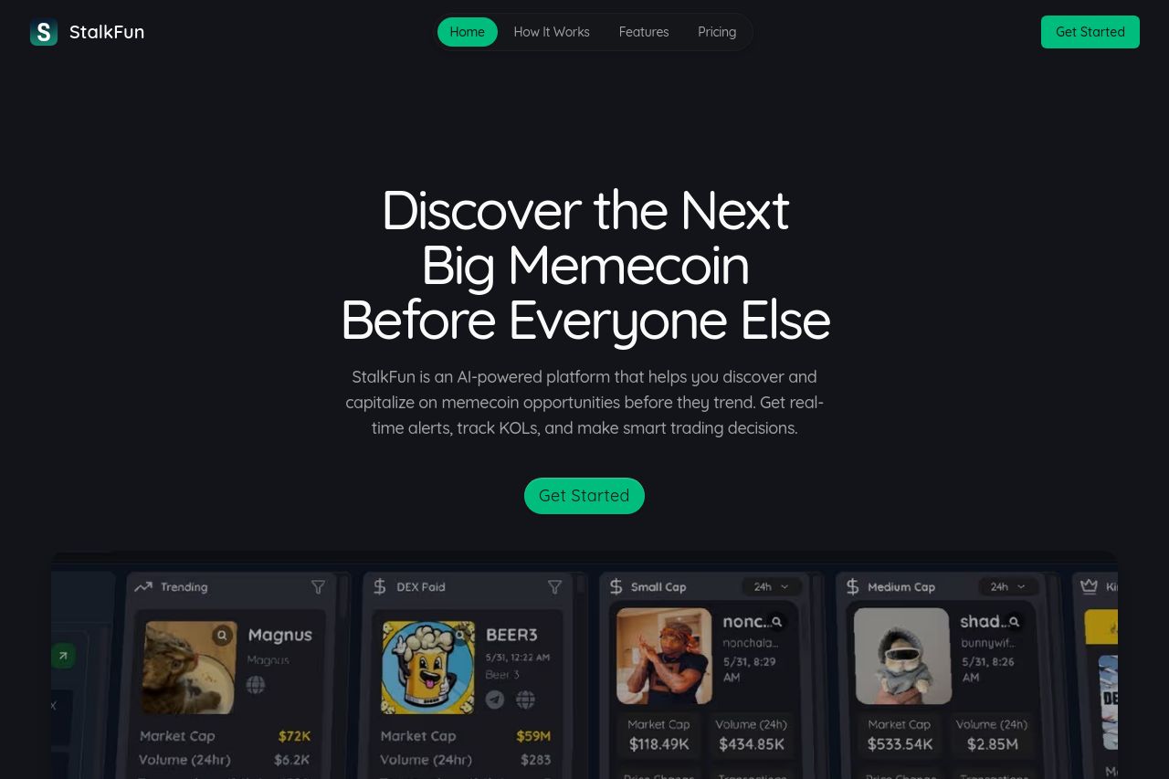
StalkFun's landing page is visually sleek but lacks in several crucial areas. The dark color scheme is bold and aligns with tech-driven audiences. However, it's overused, making readability a minor challenge. The hero section capitalizes on FOMO with phrases like "Discover the Next Big Memecoin," which is desirable for traders, yet it may not be explicit enough for all visitors. The page effectively lists features and benefits but could be more concise, cutting down repetitive phrases. Social proof is solid, with the founder's credibility highlighted, but the testimonials and user stats feel scattered. Several sections have redundant information, disrupting the reading flow and making the page seem longer than necessary. The CTAs are action-oriented, yet their placement borders on overuse. Overall, the page meets its intentions but lacks optimization to truly hook its target audience.
- Improve contrast in text to enhance readability against the dark background.
- Consolidate redundant sections to streamline user experience and improve engagement.
- Revise the structure to create a clearer narrative and smoother reading flow.