lovable.app
Landing Page Analysis
Alpha Strativa - Learn investment strategies and access professional investment plan templates

Summary:
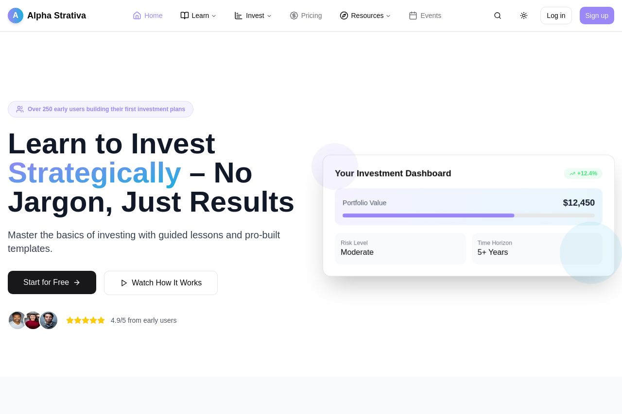
Alpha Strativa’s landing page is overall solid but lacks some aspects to really grab attention. The hero section’s value proposition "Learn to Invest Strategically – No Jargon, Just Results" is clear and aimed at simplifying investment for everyday users, but the visuals are too plain to catch the attention immediately. The text like "Start for Free" is a great CTA and stands out well, yet the call-to-action sections don't always encourage an immediate response. Structurally, the information is laid out logically and the use of testimonials builds trust. However, the design lacks consistency; some font variations and inconsistent visual hierarchy create minor confusion. The page uses typical language but avoids jargon, aligning well with the target audience new to investing.
The pricing section is easy to follow and transparent, yet the page lacks a bit of urgency or persuasive techniques to drive immediate action. Although images support the content well, they don't do much to enhance user understanding actively. Social proof with testimonials is effectively utilized, adding credibility to the investment advice offered.
- Enhance the visual hierarchy by ensuring the most important elements like CTAs and section titles truly stand out.
- Improve consistency in font and color usage to provide a more cohesive visual experience.
- Incorporate more dynamic imagery or interactive elements to engage users more actively.