buildmicroservicesingo.com
Landing Page Analysis
Learn how to create a real, complex, prod ready microservice based app in Go
Summary:
This landing page aims to engage junior developers by focusing on practical learning of microservices in Go. It starts strong with a clear, action-oriented headline, yet sometimes feels a bit overwhelming.
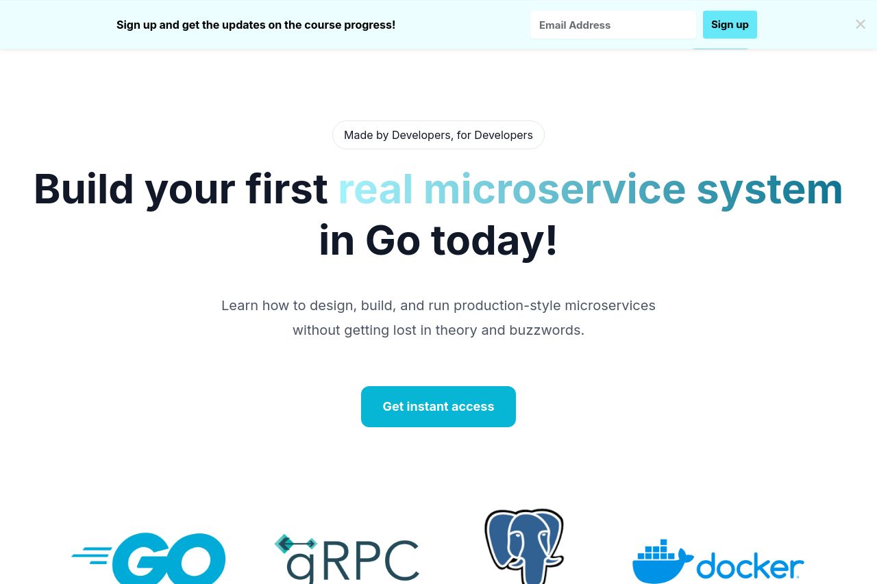
The value proposition is solid with clear delineation of the benefits and features, making it easier for potential customers to grasp. However, the distinction between sections isn't always as prominent as it could be, which might contribute to some navigation confusion. The tone is casual and relatable, well-suited to junior developers, and the use of familiar technical logos (like Go, gRPC) enhances credibility. The color scheme complements the overall professional look without being too flashy.
CTAs are well-placed but could stand out more. Clutter is minimal, yet there's an opportunity to enhance visual hierarchy with more distinct typography and contrast.
- Enhance the contrast for CTAs to make them stand out more.
- Refine the use of visual hierarchy by using varied typography and contrast to guide the user's attention.
- Clarify section transitions to improve the overall flow and ease of reading.