nueramation.com
Landing Page Analysis
Nueramation - Automating Operations for Growth-Focused Businesses. Get more leads, calls, and save time with our cutting-edge automation solutions.
Summary:
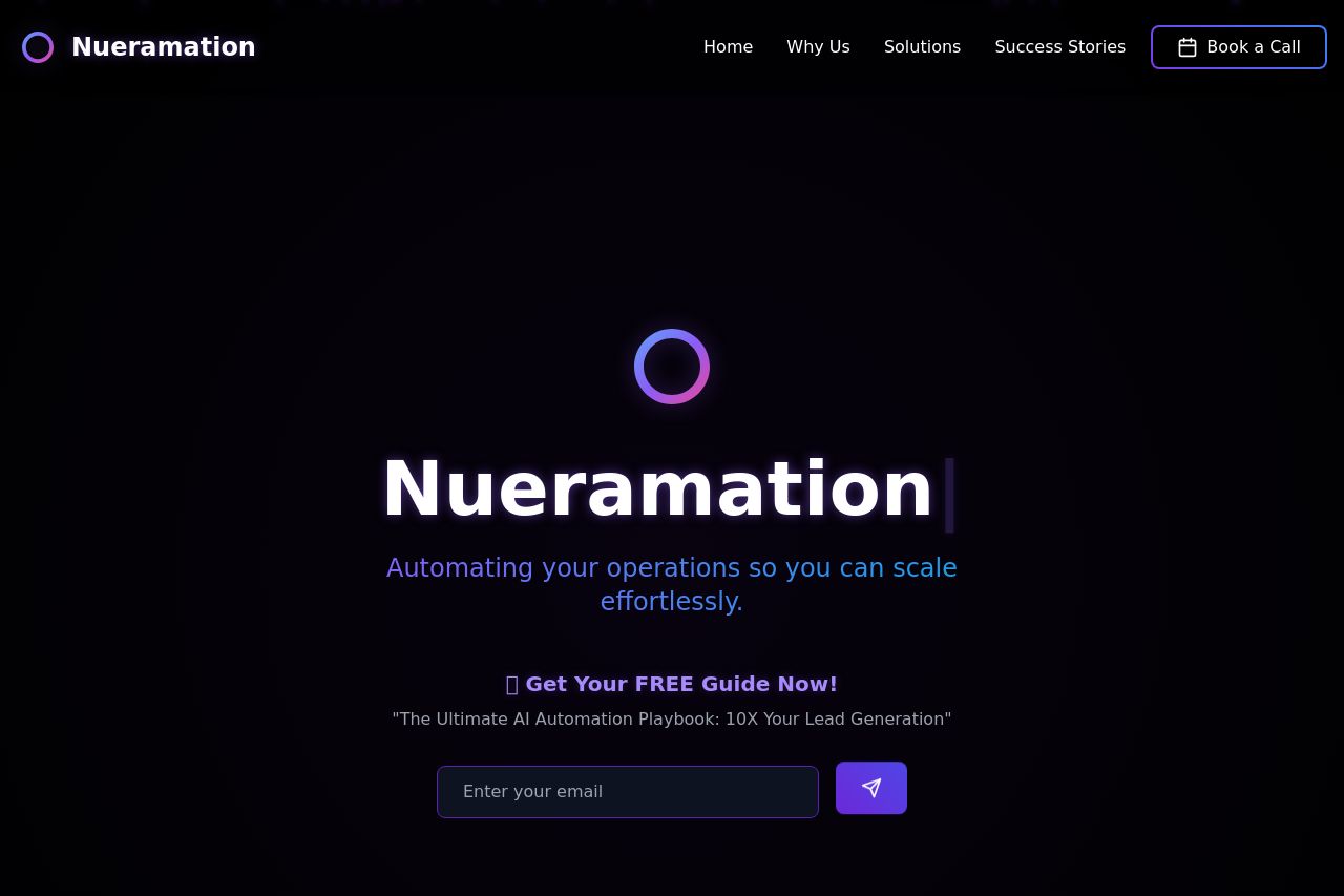
The page does an excellent job of communicating its value proposition without overwhelming the visitor. The dark theme combined with the neon accents creates a sleek look but may not cater to every user's preference for readability. There are clear trust elements like known client logos which enhance credibility. However, the call-to-action is slightly repetitive because the opportunity is mentioned twice back to back, which can come across as desperate.
The layout is organized, with each section leading logically to the next, but the typography lacks differentiation, which can make scanning the content difficult. Overall, it aims to attract digital agencies by highlighting efficiency and ROI boost but could improve significantly on user engagement through better typography and CTA placement strategy.
- Simplify CTA presentation to avoid redundancy.
- Introduce more contrast in typography for better readability.
- Make the CTAs more distinct and specific.