dostechs.com
Landing Page Analysis
Discover a stunning portfolio website created with Avada, showcasing creative projects and innovative designs using the ultimate WordPress website builder.
57
Share on:
Summary:
40
Messaging
60
Readability
80
Structure
50
Actionability
60
Design
35
Credibility
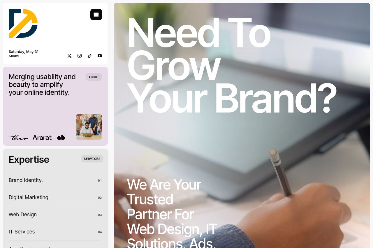
The page exhibits a balanced layout, with a clear value proposition asking visitors if they need to grow their brand. However, it's too generic and lacks specific targeting. The call to action "Let's Talk" could benefit from more urgency or specificity. The imagery supports the messaging but could provide more context to differentiate services. The color palette is cohesive but doesn't make the CTA stand out enough. Typography is clean but not dynamically used to create a strong visual hierarchy. Additionally, there are missed opportunities for clear audience targeting.
Main Recommendations:
- Define the target audience more explicitly in the messaging.
- Enhance the CTA with more action-oriented language and visual emphasis.
- Use more dynamic imagery or examples that highlight specific services.