nike.com
Landing Page Analysis
87
Share on:
Summary:
70
Messaging
85
Readability
95
Structure
60
Actionability
90
Design
100
Credibility
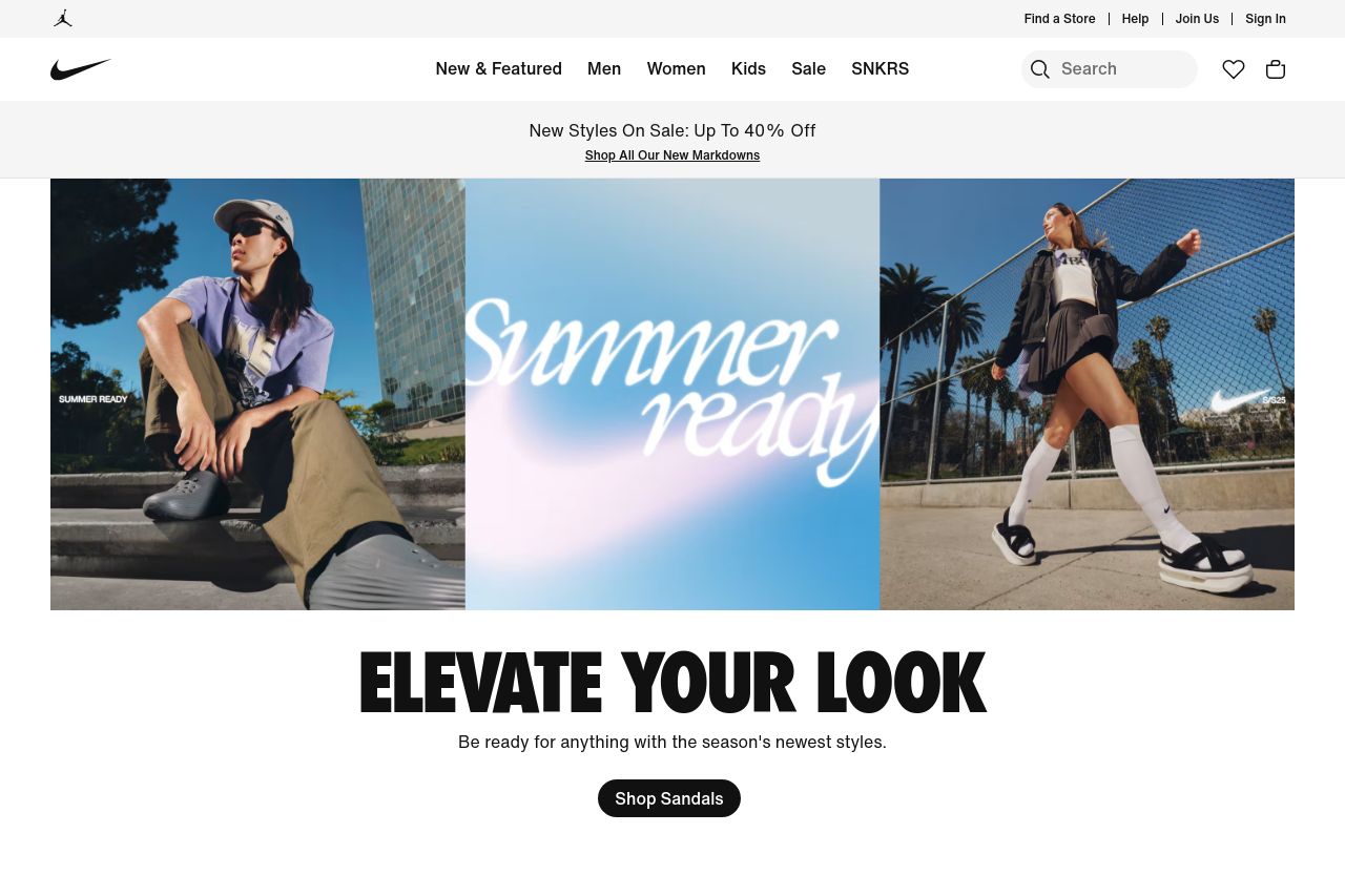
The landing page is visually appealing with strong use of imagery to showcase products, which works well for the brand. The typography is bold and engaging, making headlines like "ELEVATE YOUR LOOK" stand out. However, the call-to-action buttons blend in a bit too much with other elements, decreasing actionability. The structure is intuitive, but it could benefit from more explicit customer testimonials or reviews for enhanced credibility. Overall, this is a modern, clean design with room for optimization in action prompts and user engagement features.
Main Recommendations:
- Enhance call-to-action buttons to make them more noticeable.
- Introduce customer reviews or testimonials for credibility.
- Adjust button colors to improve contrast and actionability.