getinterviewiq.com
Landing Page Analysis
Struggling in interviews? Get AI-powered answers in real time during calls. Works with Google Meet. Try for free
Summary:
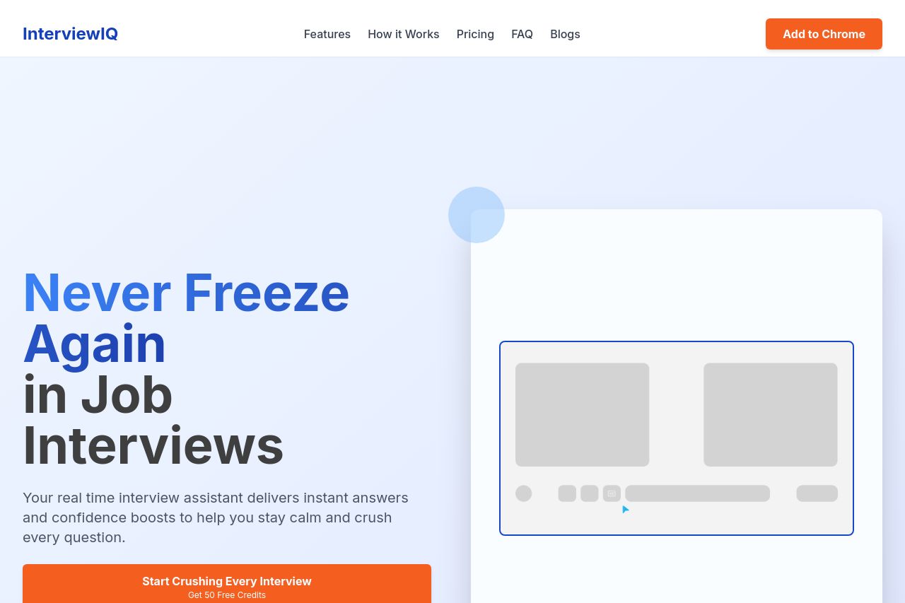
InterviewIQ's landing page hits several right notes but lacks perfection. The value proposition is clear, iterated as "Never Freeze Again" and reinforced throughout. The headline grabs attention well, and the message that the assistant provides "real-time answers" and "confidence boosts" speaks directly to job seekers. However, it could benefit from more examples or demos to solidify credibility.
The design is clean and consistent, with an excellent use of color schemes—blue invokes calmness and authority, and orange is striking for CTAs. However, while hierarchy seems okay, some text blocks lack variety in size and weight, which could hinder visual interest.
Readability is decent but could improve with shorter paragraphs and less repetitiveness. The page contains great whitespace, which helps scanning, but typography could be more dynamic.
CTAs are action-oriented and strategically positioned, yet some redundancy in messaging could be streamlined. It risks overwhelming the user with multiple varied calls to "Add to Chrome."
Transparency is okay with decent contact information and detailed pricing plans, enhancing trust, but additional social proof like testimonials would add much-needed credibility.
- Add real-life examples or case studies to demonstrate effectiveness.
- Streamline CTAs to maintain focus without overwhelming the user.
- Incorporate more diverse typography to enhance readability.
- Include testimonials or social proof to strengthen credibility.