generateads.ai
Landing Page Analysis
Summary:
Generate Ads Landing Page Analysis
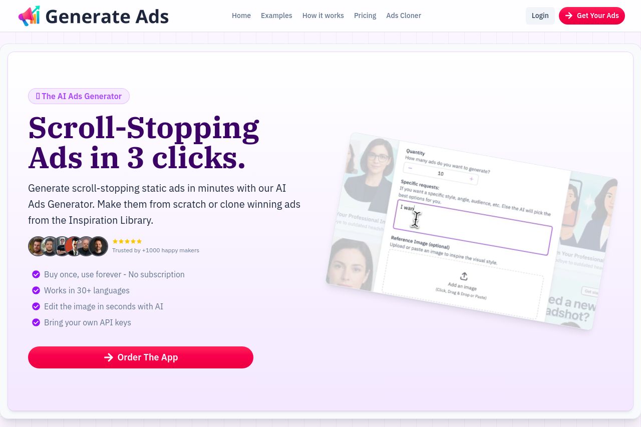
The landing page for Generate Ads thrives with a strong value proposition promising 'Scroll-Stopping Ads in 3 clicks.' The simplicity is a win since potential users can immediately understand the product's main benefit—quick and effective ad creation. The supporting text, 'Generate scroll-stopping static ads in minutes,' reinforces the benefit but dives no deeper into specifics, leaving a missed opportunity for deeper engagement.
Visually, the site employs a bold, clean design that highlights the CTA, 'Order the App,' strongly, making it hard to miss. However, while the aesthetic is eye-catching, it falters in consistency with fluctuating font sizes and colors that detract from a unified experience.
The testimonials and user statistics—'4,000+ ads generated'—provide solid social proof, bolstering credibility but could be more prominently leveraged. While the design is professional, the lack of featuring the team or offering detailed contact information misses out on enhancing transparency. Lastly, the open graph data that is 'N/A' signifies a missed opportunity for optimal social sharing.
Overall, Generate Ads presents a polished landing page that could benefit significantly from improved consistency in design and deeper, clearer communication of features and benefits.
- Enhance the value proposition by adding specific features and benefits.
- Ensure consistent font sizes and colors across the page for visual harmony.
- Highlight testimonials and social proof more prominently to boost credibility.
- Provide more specific contact information to improve transparency.