idlefarmer.africa
Landing Page Analysis
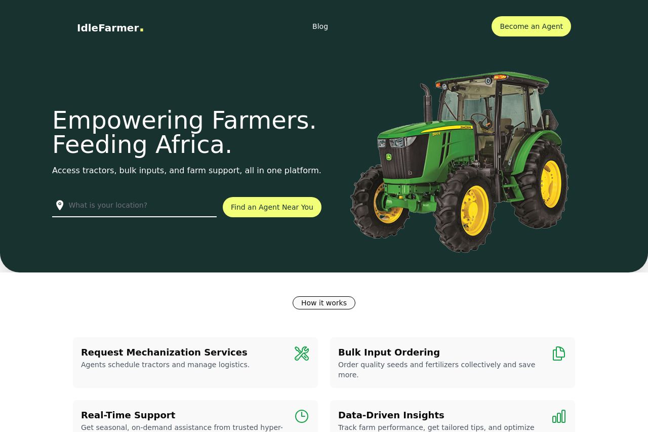
Access tractors, bullk inputs, and farm support exclusively
Summary:
IdleFarmer has a clean and focused presentation, but there's room for strengthening the clarity and actionability.
Messaging is aligned well with the target audience of farmers and agricultural partners. The content is straightforward and relevant, but it lacks depth and explicit audience targeting in some areas.
The readability is decent with short sentences and good typography, though the text could benefit from breaking down long paragraphs and offering more engaging formats like bullet points.
The design maintains a consistent style with its color scheme that is fitting for the agricultural theme. However, a more pronounced visual hierarchy could enhance focus on important elements.
In terms of structure, the information is logically presented, making the site easy to navigate. Yet, additional headers and clearer content separation would improve flow.
Lastly, the credibility aspects are generally covered with clear contact information and a professional feel, though a more visible display of testimonials or client logos could boost trust.
- Enhance clarity and emphasis in the value proposition by specifying target audience benefits clearly.
- Improve visual hierarchy by adjusting font sizes and colors to highlight key points.
- Add more social proof elements like testimonials or logos from partnerships.
- Use more engaging content formats, such as bullet points, to increase readability.