framer.app
Landing Page Analysis
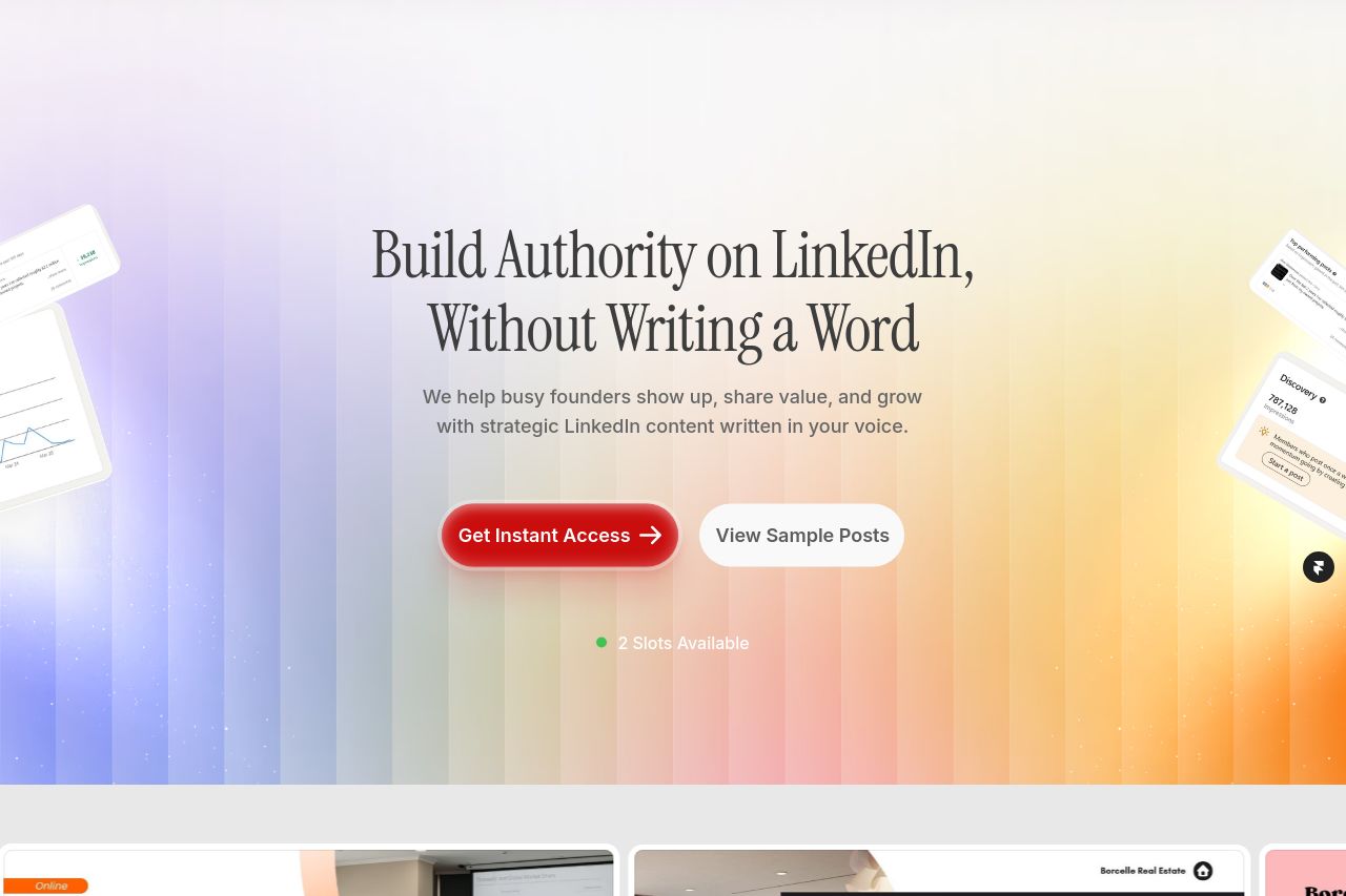
Done-for-you AI content systems for startup founders to write high-converting LinkedIn posts in less time. Boost visibility, attract leads, and build founder authority.

Summary:
The landing page excels in visually engaging elements and a clear CTA but falls short in originality and finesse. The value proposition is loud and clear, tailored towards SMB founders with the offer to "Build Authority on LinkedIn, Without Writing a Word." Yet, the page lacks a truly unique flair with its generic background visuals and slightly overwhelming display of pricing plans, which could confuse visitors. Notably, the scarcity technique adds urgency but borders on desperation with repetitive mentions of "slots available". Testimonials and client logos enhance credibility but could be more strategically placed to avoid overpowering the main narrative. Overall, the design and structure are decent but call for refinement to strengthen focus and clarity.
- Reorganize the CTA placements to enhance focus and avoid overuse.
- Introduce more concise and engaging visual hierarchy to guide the viewer's eyes.
- Simplify and unify the design to create more aesthetic consistency.