testit.so
Landing Page Analysis
Create experiments in just a few clicks and start improving your conversion rate today. No coding required. Want to be sure your landing page converts? Test it!
Summary:
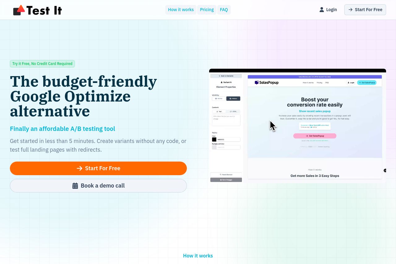
The page offers a visually clean and appealing experience, with a solid and straightforward pitch as a budget-friendly alternative to Google's services. The hero section immediately lays out the value proposition — affordable A/B testing without any coding headache. The CTA "Start For Free" is aggressively placed, though a bit overused, causing it to lose impact. The messaging across the page speaks directly to frustrations with more expensive solutions, which is likely to resonate well with the target audience of small to medium businesses or individuals looking for an easy solution.
On the downside, the repetitiveness of the CTA makes it easy to overlook, reducing its effectiveness. Some sections are cluttered with too much text, like the "Why Test It?" section, which might deter quick-reading visitors. While testimonials and proof points add credibility, enhanced social proof from known partnerships or integrations could solidify trust. Visually, the design could benefit from stronger color contrasts and hierarchy, especially around CTAs, to make key actions even more apparent.
- Reduce CTA repetition to make each instance more impactful.
- Enhance color contrast for buttons to make CTAs stand out more.
- Condense text in informative sections to improve readability.