replicode.co
Landing Page Analysis
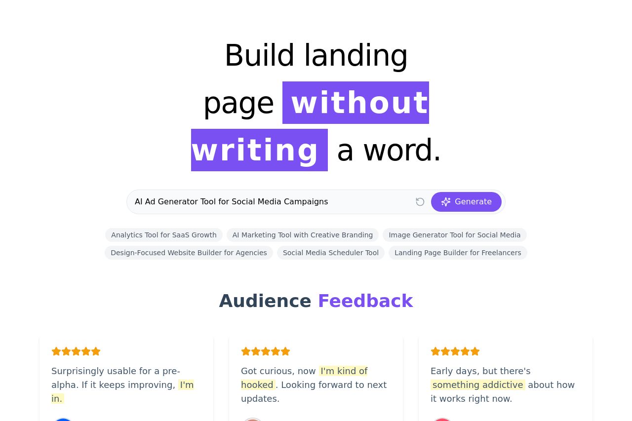
Describe your business, get a template with AI-generated copy and deploy your page with a click.
Summary:
The landing page clearly presents its value proposition—'Build landing page without writing a word'—right at the top, appealing to users looking for quick solutions.
The focus on 'without writing' grabs attention, and the call to action 'Generate' is prominently placed, guiding users effectively.
The testimonials section adds credibility, showing positive user feedback. However, it could benefit from more specific details or recognizable logos to boost trust.
Color contrast, especially the use of purple to highlight 'without writing,' makes key details stand out and draws the viewer's attention immediately. There's good use of whitespace to avoid clutter, but some headings blend into the body text a bit too much.
Overall, the design is modern and visually appealing, but could improve on enhancing the hierarchy and cohesive elements throughout the page.
- Enhance the visibility of key headings by using different fonts or sizes.
- Add recognizable client logos or more detailed testimonials to boost credibility.
- Improve the visual hierarchy with more distinct text styles and sizes.