rupalisevanursingbureau.com
Landing Page Analysis
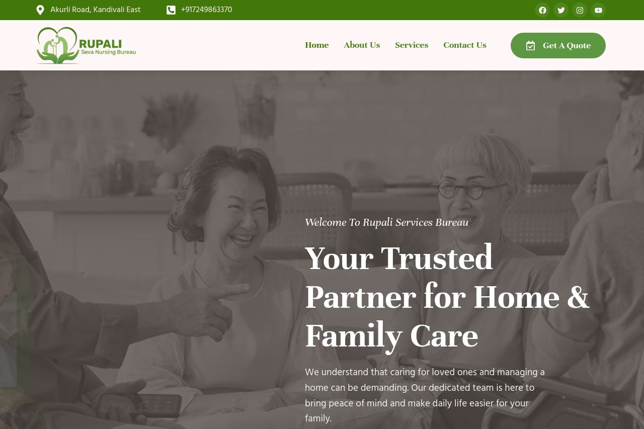
Skilled medical support dedicated to your health and comfort at home.
Summary:
On the positive side, the page uses a consistent color scheme with greens and whites that align well with the nurturing and health-oriented theme. The imagery is relevant to the services offered, portraying warmth and care. The call-to-action buttons are visible, providing a clear path for user engagement.
However, there are several areas needing improvement. The value proposition is too vague and lacks a specific call to emotions or urgent issues that might engage visitors better. The sections lack clear hierarchy and don’t guide the user smoothly from one point to another, making it easy to lose focus. The text is quite dense with long paragraphs that might deter quick reading. There is a noticeable absence of social proof elements like testimonials or recognizable partnerships and logos that boost credibility. Icons and their accompanying text lack emphasis, so they don’t stand out as key elements of those sections.
- Highlight customer testimonials or success stories for credibility.
- Revise and simplify text for better readability and engagement.
- Add explicit value proposition addressing specific audience needs or pain points.