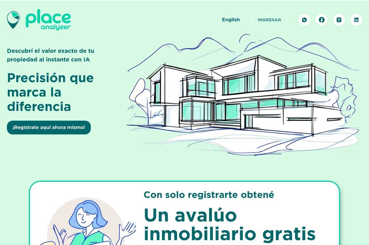
placeanalyzer.com
Landing Page Analysis
¿Deseas conocer el valor de tu propiedad?. Place Analyzer utiliza un algoritmo para estimar el valor de tu propiedad con una sorprendente precisión

Summary:
The landing page is visually appealing but lacks impactful communication.
The value proposition is somewhat clear, but lacks direct examples or demos that could contextualize its benefits more effectively. The audience is wide, and there’s a missed opportunity to really speak to specific segments.
Text readability gets bogged down with lengthy descriptions without clear breaks, although the typography itself is clean and readable. Design consistency is passable, but the layout sometimes becomes heavy, especially with large chunks of text and similar color usage which muddles the hierarchy.
The structure is acceptable with logical flow overall, but it could benefit from a tighter, more interactive reading flow. The CTAs aren’t well-placed—they need more focal emphasis to hit their mark. Yet, credibility is well-supported with client logos and accolades, giving a strong professional backing.
- Simplify the text by breaking it into more digestible pieces with bullet points or subheadings.
- Enhance CTA visibility by adding contrasting colors and strategic placements after informative sections.
- Incorporate more visual elements like demos or infographics to break the monotony of text and engage the audience.