super-abu.com
Landing Page Analysis
Web site created using create-react-app
Summary:
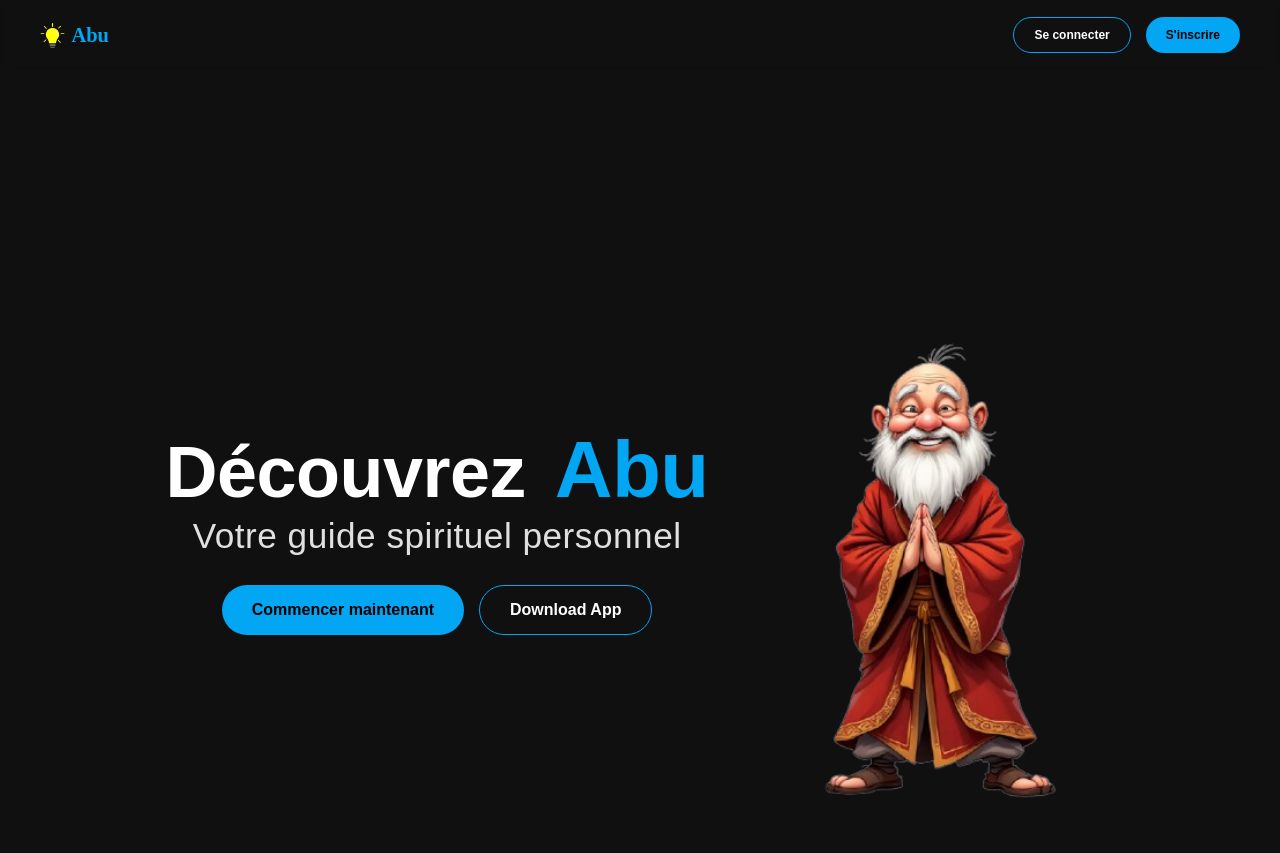
The website features a simplistic design with a black background and consistent use of a spiritual guide theme through character imagery, which adds some unique flavor. However, the overall appeal and clarity suffer from several issues.
Messaging is a bit vague. While "Découvrez Abu" adds some intrigue, it doesn't effectively communicate what makes Abu special apart from basic spiritual guidance. Visual hierarchy and contrast need serious improvement. The blue text stands out, but other text elements blend into the meh background, making essential details hard to find. The call-to-action buttons are visible, but the lack of clear benefits tied to these actions makes them less effective.
Readability is another concern. Although the typography is legible, the thin, light fonts against a dark background could cause eye strain without providing additional formatting to guide the eye through the content. While consistency in theme is maintained, the lack of more engaging, varied content makes the user journey feel rather dull. Information hierarchy is poorly executed, as the site's purpose and benefits aren't immediately clear. Finally, while the simple graphics capture the spiritual vibe, the website lacks testimonials or social proof to boost credibility.
- Enhance the value proposition by clearly stating what sets Abu apart.
- Improve visual hierarchy to guide users better through the content.
- Add social proof or testimonials to build credibility.